ACE & TATE
Eindhoven, NL
retaildesign
Eindhoven, NL
retaildesign
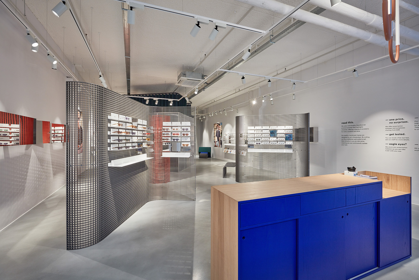
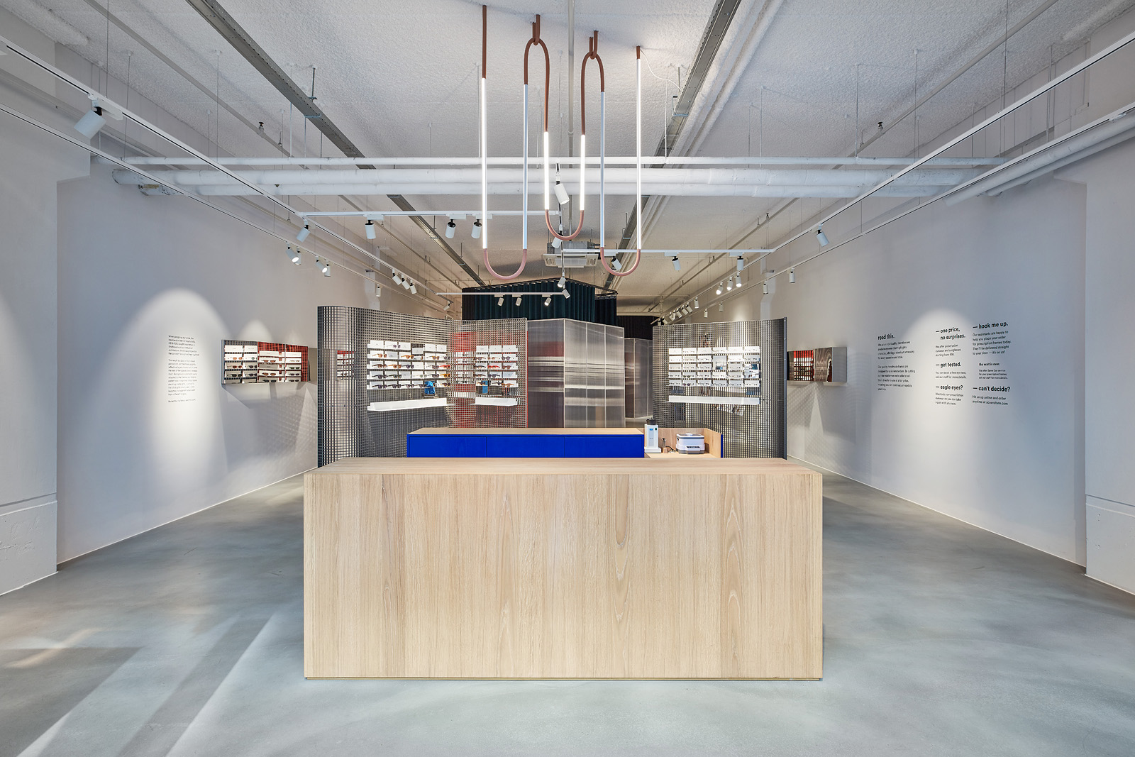
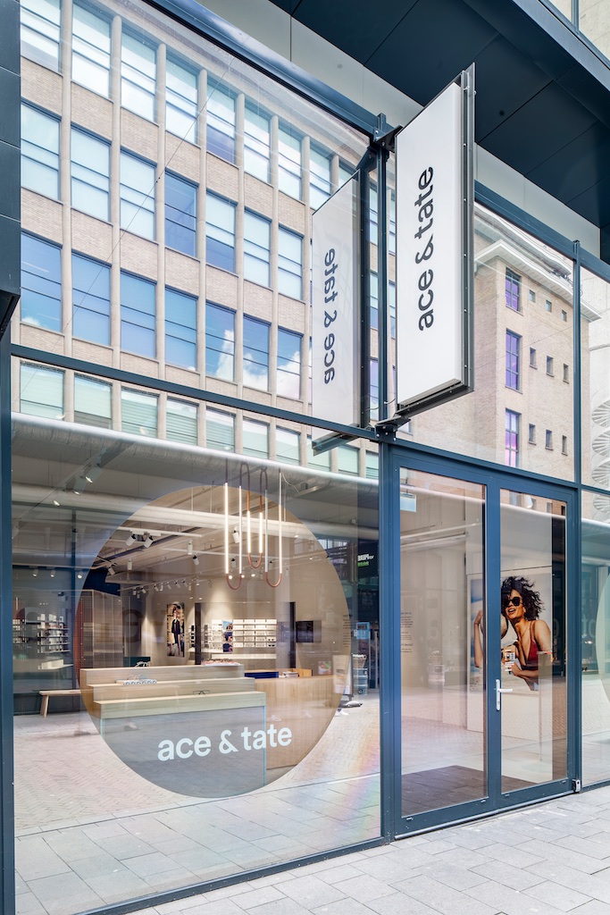
The store is situated on the Nieuwe Emmasingel, a promising area for the brand to settle in, with local favourite Van Piere bookshop nearby and the Design Academy Eindhoven just one short walk away. This is Ace & Tate’s biggest space so far, having enough space to fit two optician rooms and a large multifunctional podium with which customers can interact with.
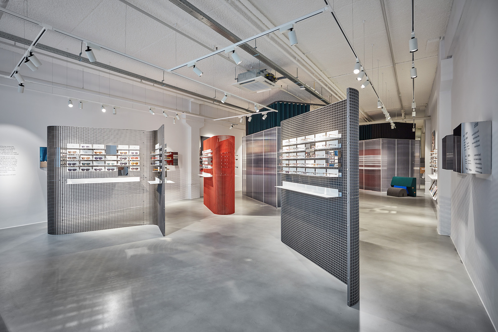
This time, the brand collaborated with local studio OS & OOS, whom are known for their work in contemporary functional design. When designing our store, the creative duo behind OS & OOS sought inspiration in Eindhoven’s unique industrial architecture, whilst keeping within the concept ‘far sighted/near sighted’.
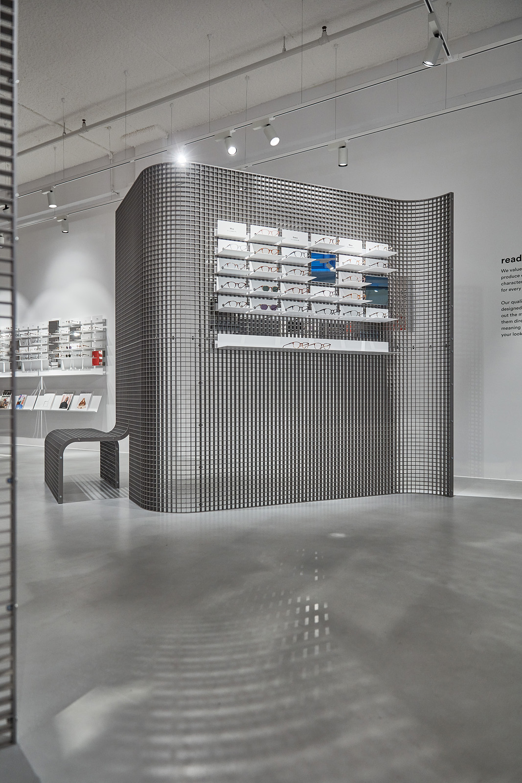
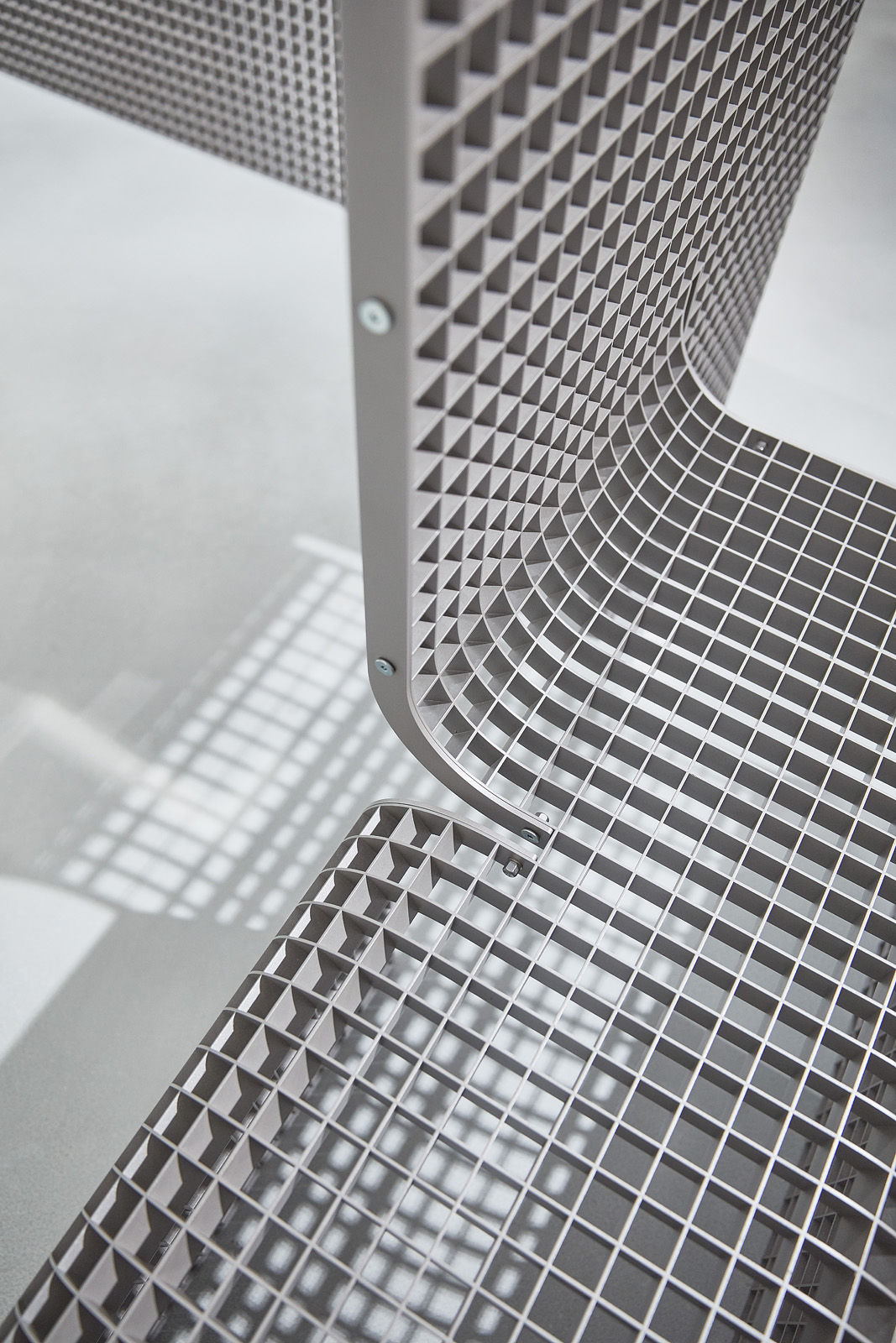
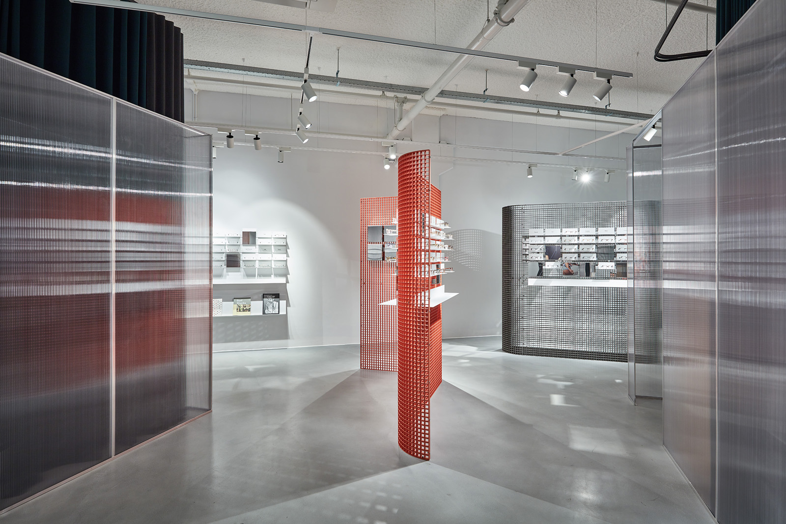
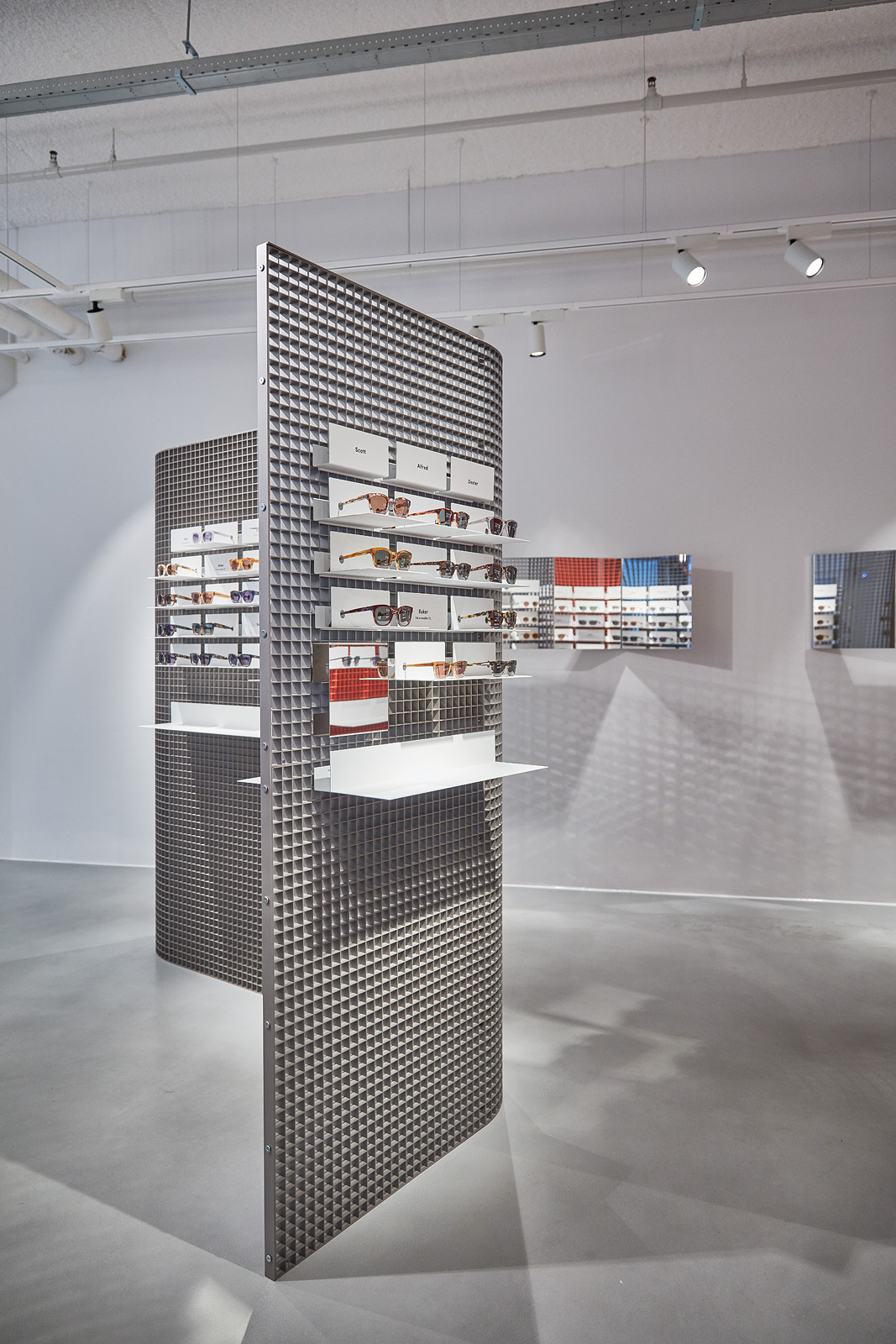
The result is a play on our visual perception, as the store’s slightly reflective façade draws you in, and the rest of the space slowly reveals itself. Recognisable elements were adapted to the theme: our display system was integrated into a loose standing metal grid - a nod to the city’s industrial architectural structures - and becomes transparent when seen from different angles.
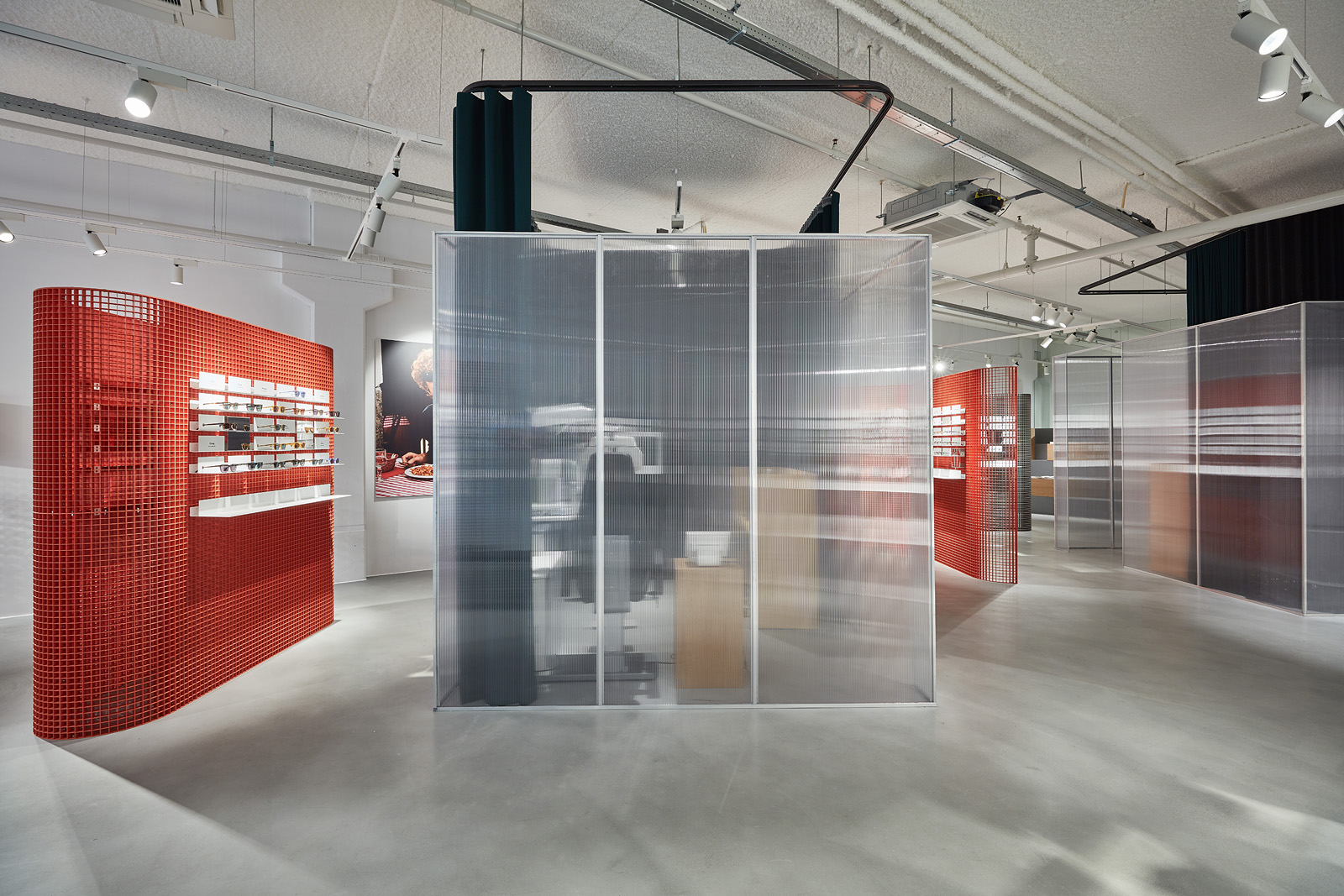
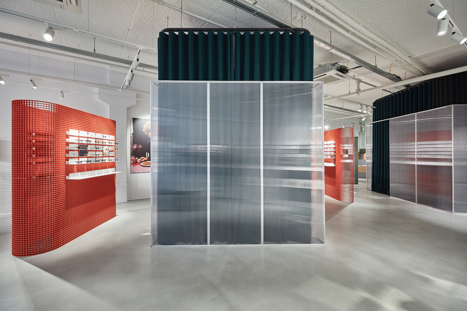
The optician rooms have also been given a special treatment and are the store’s most prominent feature: when an eye test is in progress, the polycarbonate cubes are closed off by a curtain, and when not in use, their purpose is revealed.
client: Ace & Tate
pictures by: Jeroen van der Wielen
completion: july 2017
address: Nieuwe Emmasingel 26, 5611 AM Eindhoven, NL
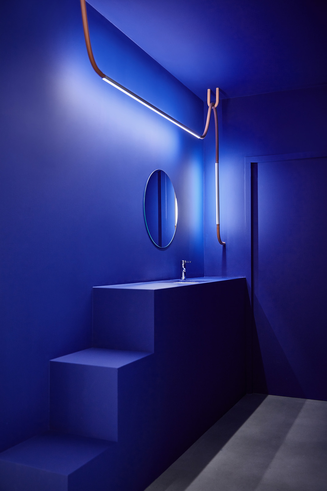
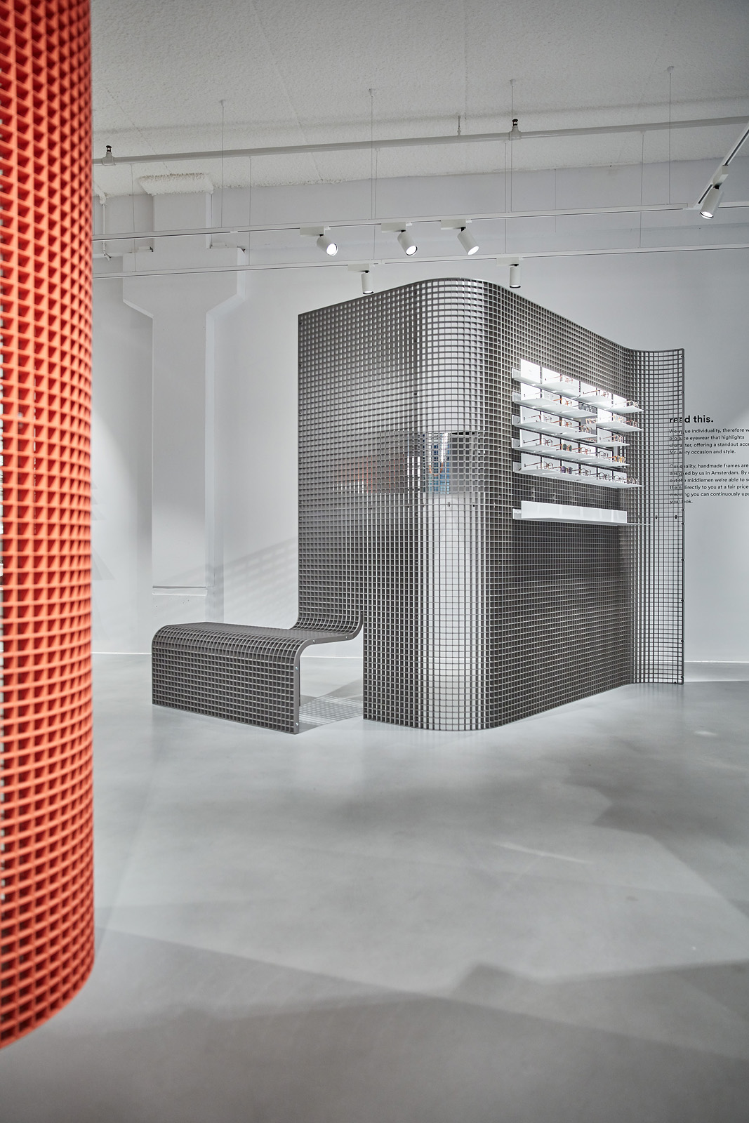

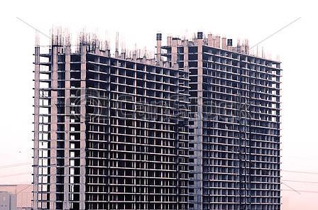
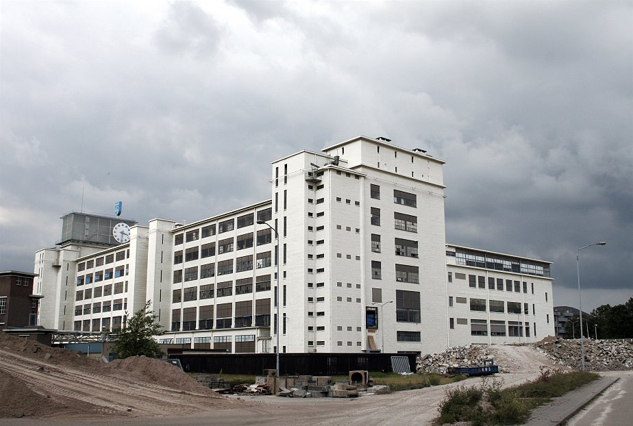
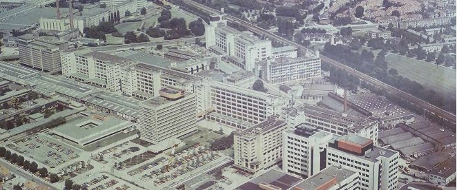
We sought inspiration in Eindhoven’s unique industrial architecture, whilst keeping within the concept ‘far sighted/near sighted
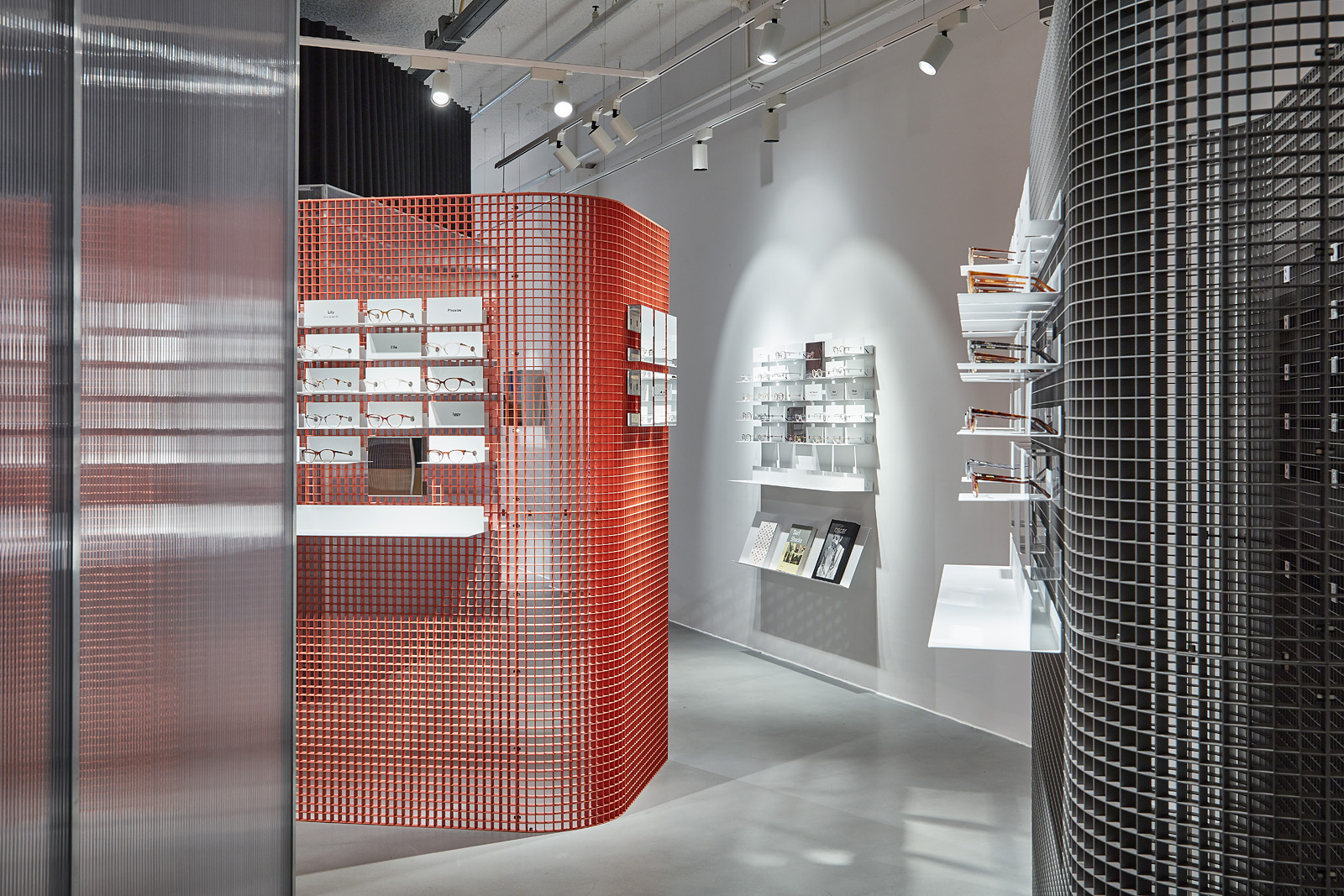
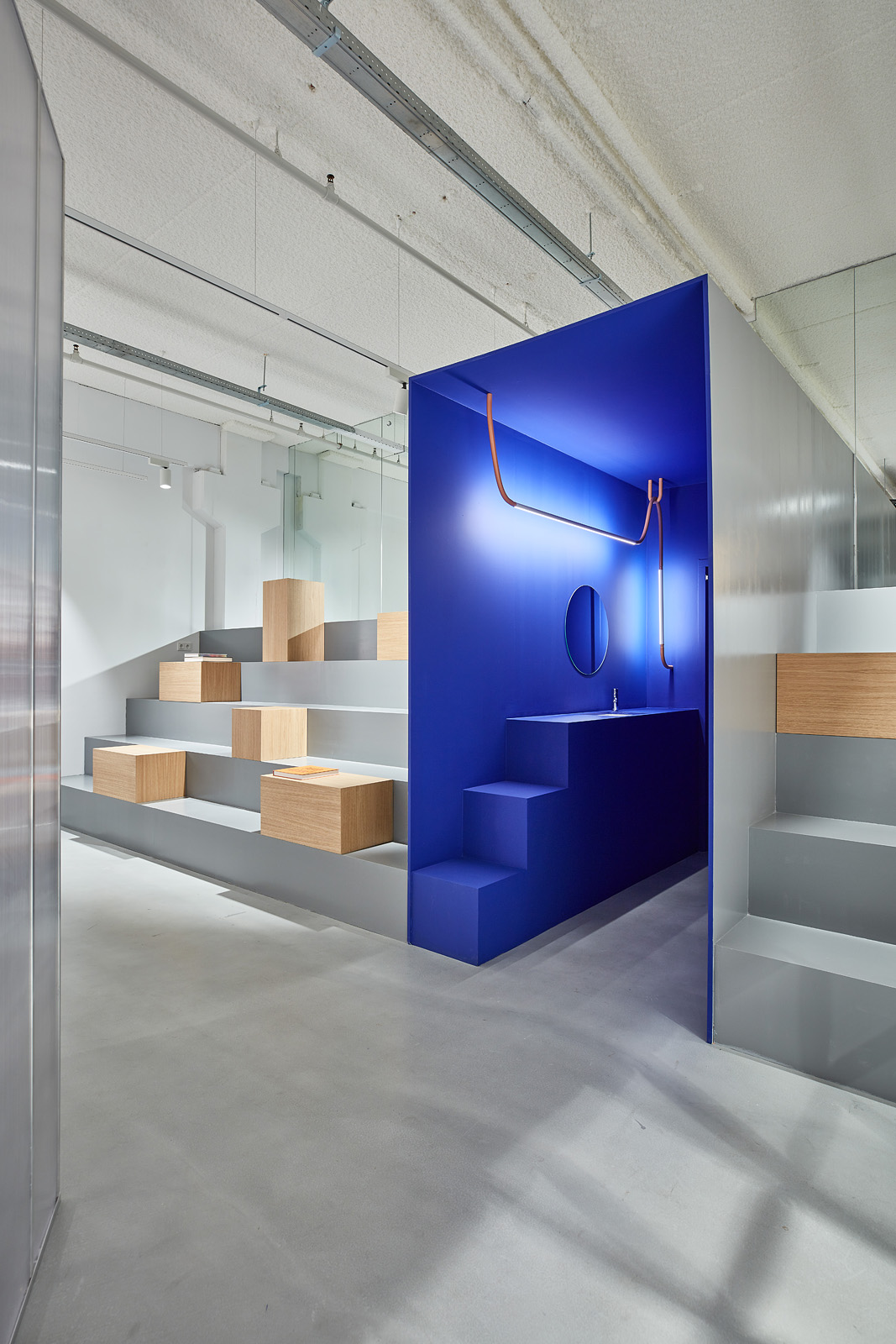
In the back of the store there is an area designed for different purposes
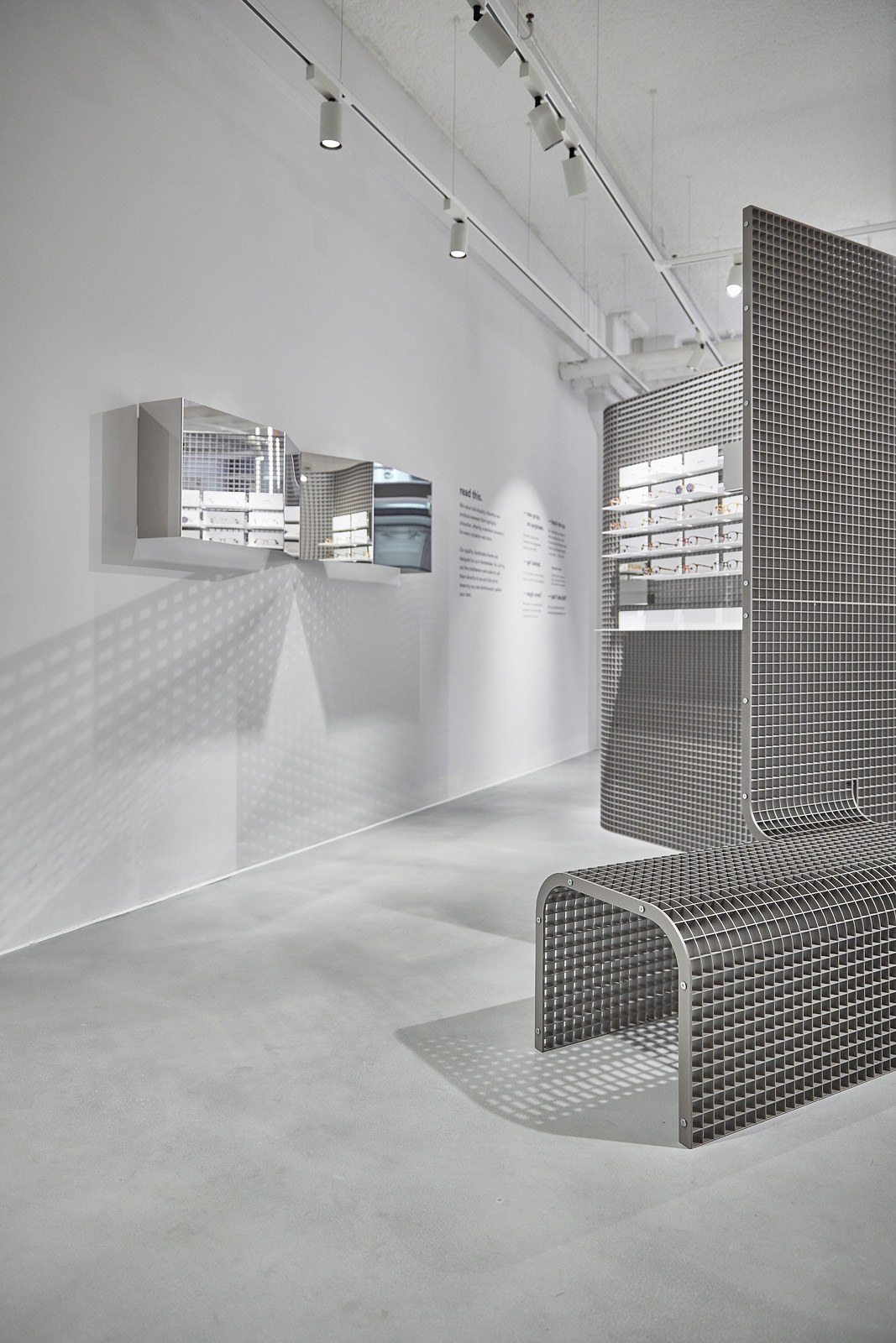


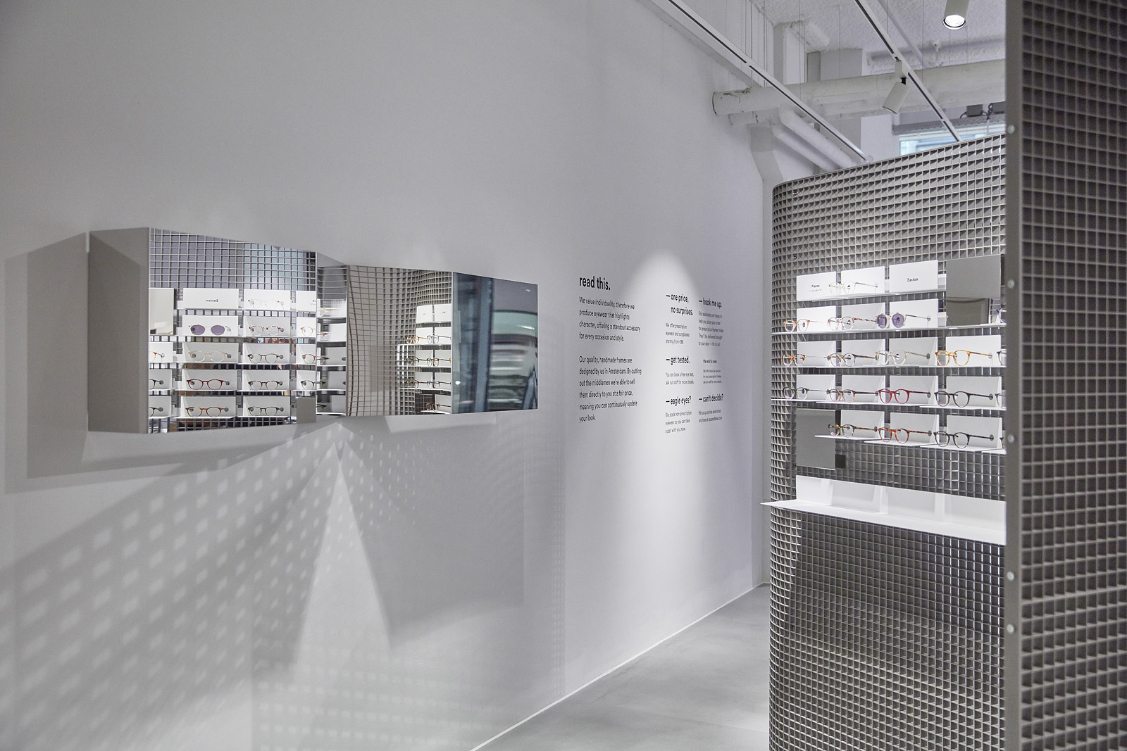
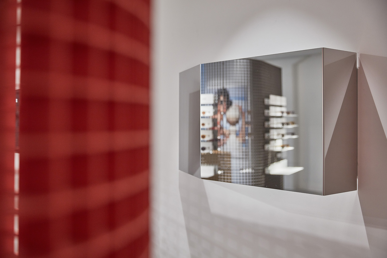
mirrors made out of highly polished stainless steel are designed to
