ACE & TATE
’s-Hertogenbosch, NL
retaildesign
’s-Hertogenbosch, NL
retaildesign

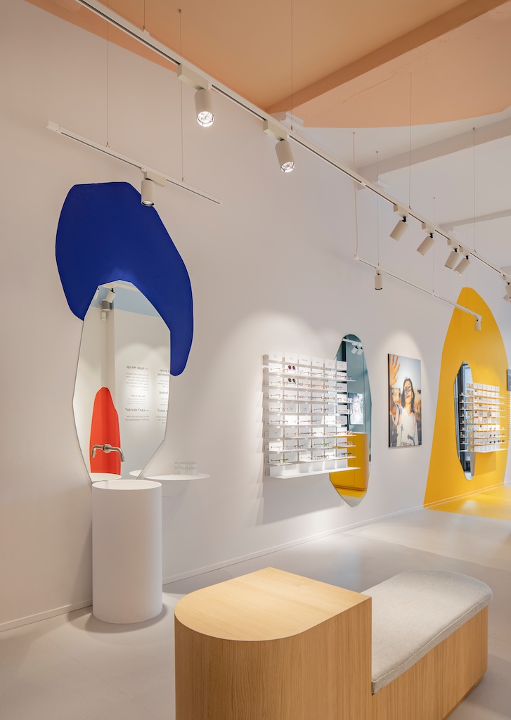
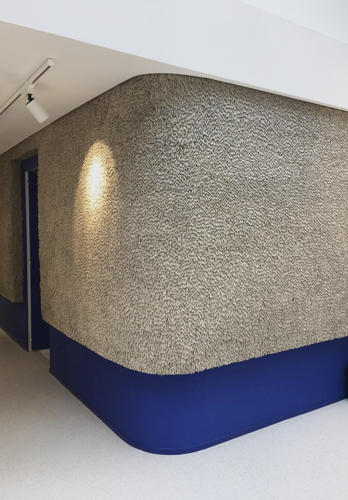
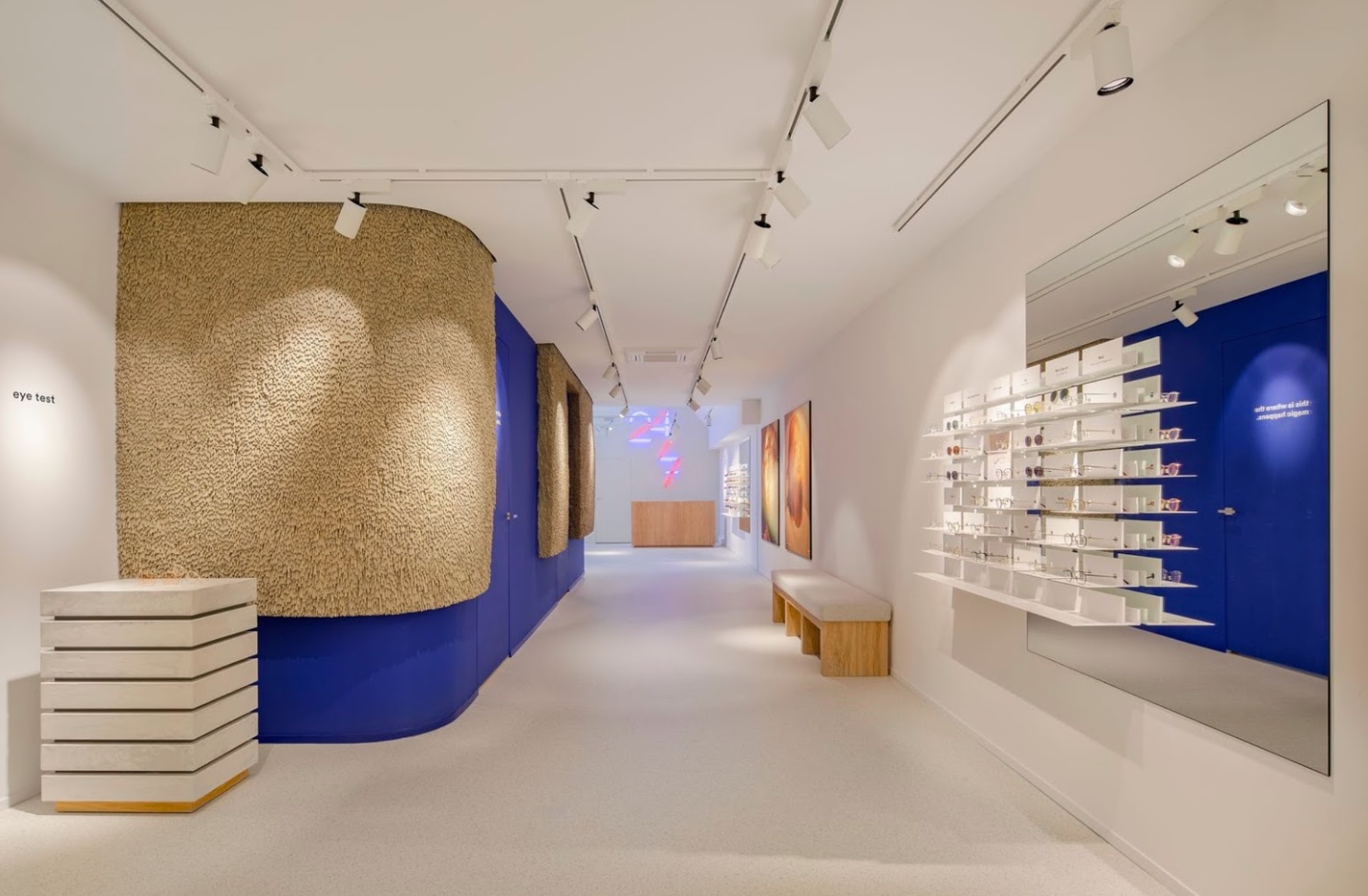
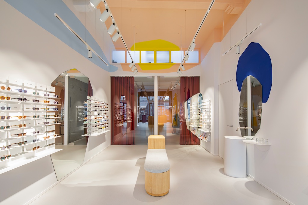
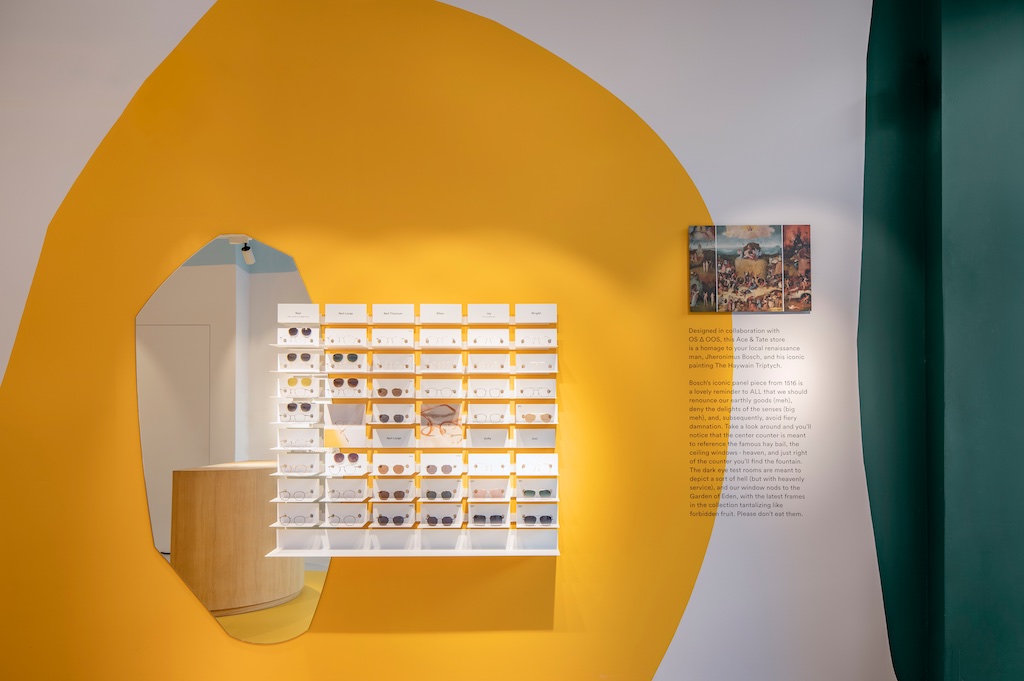
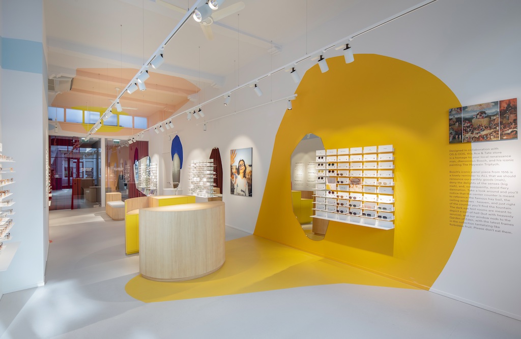
For the designer eyewear brand Ace & Tate store in ‘s-hertogenbosch in the Netherlands one iconic painting in particular (which is actually a combination of three works in total) ‘Haywain Triptych’ from 1516 is used as a main source of inspiration for the stores layout. Here iconic figure for the city of s’-Hertogenbosch; artist Jheronimus Bosch depicts three worlds.
Bosch a famous Dutch painter; born and worked his entire life in this city and is therefore an icon for it.
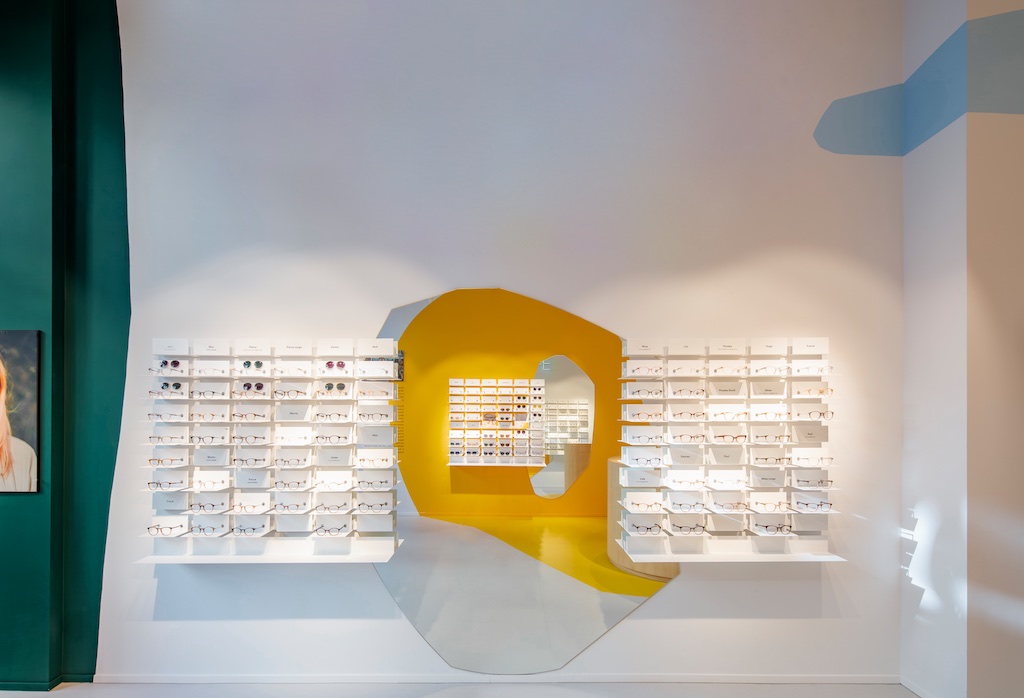
The painting is not only intriguing in its storytelling, but colour use and composition was also translated via the studios own handwriting. Resulting in unique features throughout to be discovered.
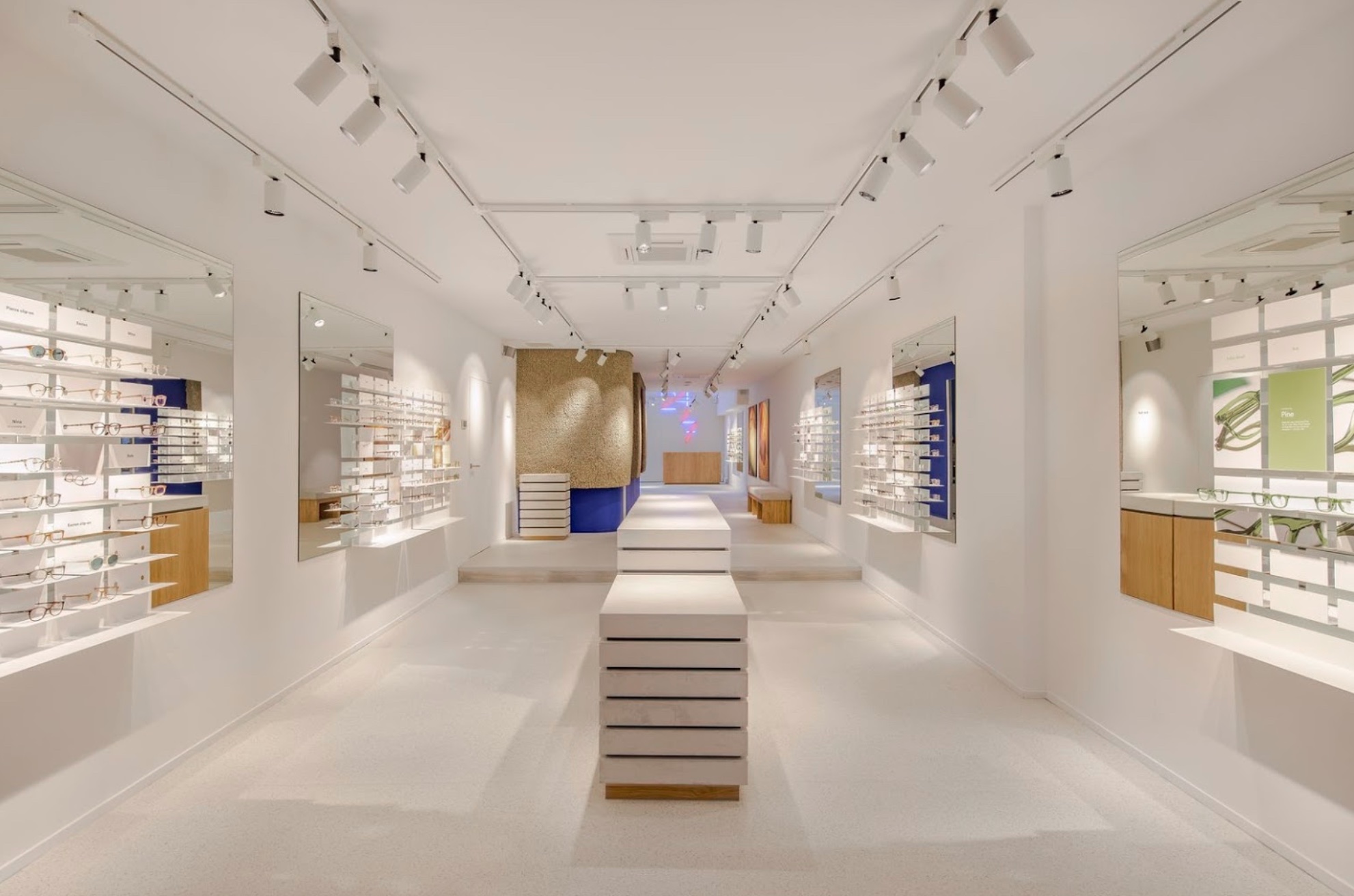
As lovely reminder to all that we should renounce our earthly goods, deny the delights of the senses and subsequently, void fiery damnation. The center of the store where the counter is situated is meant to reference the hay bail and the heavens above it represented by the small cluster of windows towards the upper ceiling at the back. A fountain, a favorite element in Bosch’s work sits just right of the store behind the counter, where clients can wash their hands and take out their lenses. Spotted around the store are also a few references to the paintings inhabitants mainly represented in blue and red each referring to their particular gender.
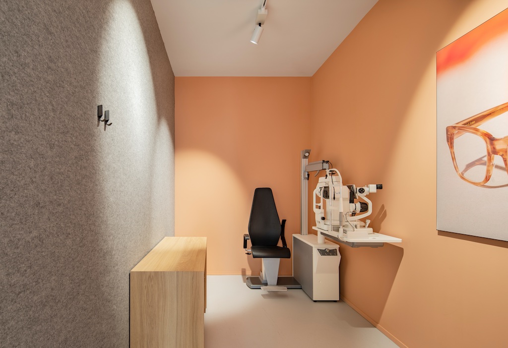
In the back dark eye test rooms fall to lower light representing the third and most right painting of the original three depicting a sort of hell, yet showcasing some of the most beautiful colors in darker tones, set behind glass, and colors of the painting itself are abstractly blotched in soft shapes throughout the store as to almost represent the painting in human scale.
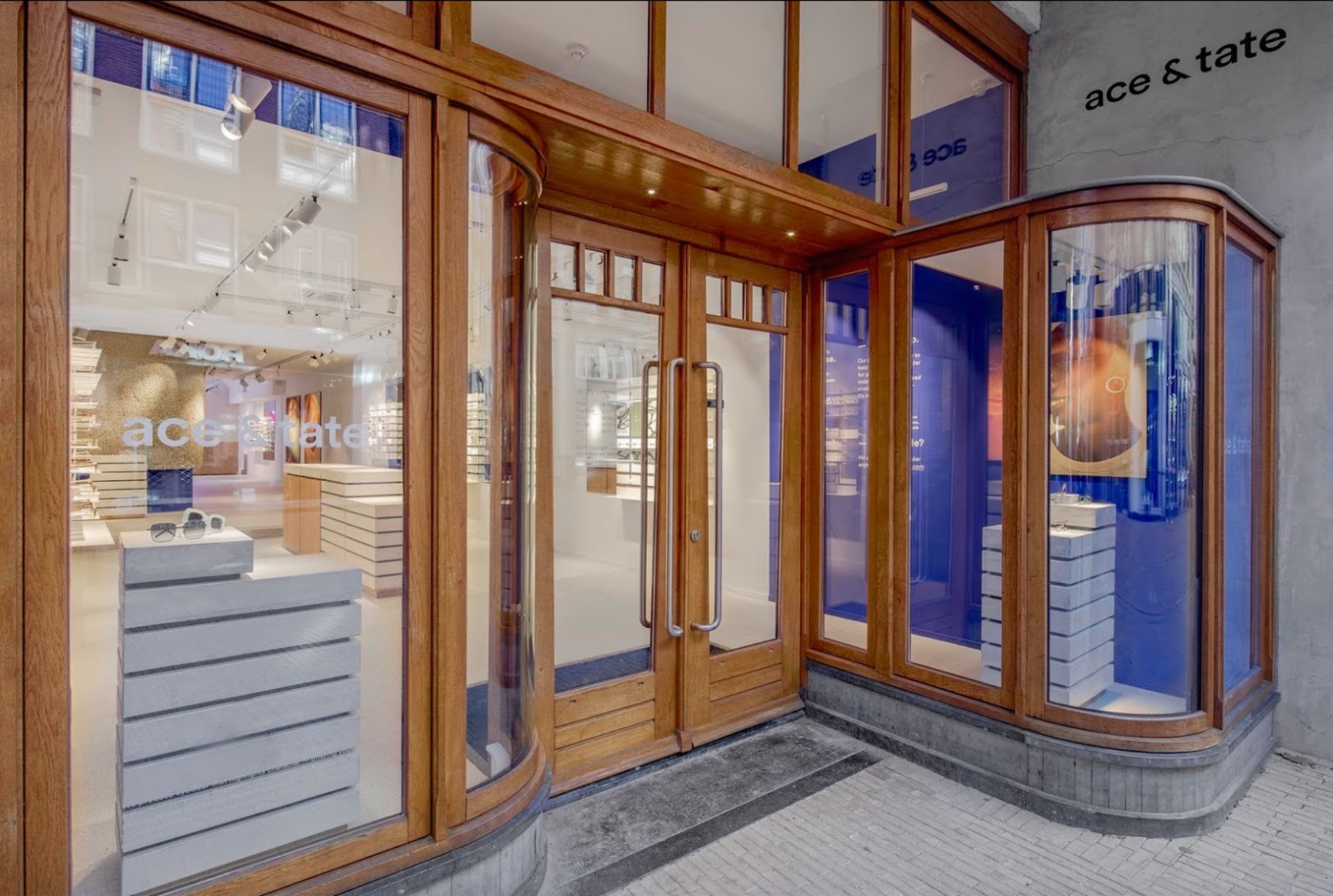
The showcase window to the front is most plainly represented by the Garden of Eden, as the latest frames in the Ace & Tate collection tantalize passer byes like forbidden fruit as represented by the most left painting to complete the set.
client: Ace & Tate
pictures by: Wouter van der Sar
completion: april 2019
address: Fonteinstraat 8,5211 HP ‘s-Hertogenbosch, NL

Jheronimus Bosch ‘Haywain Tripty
![]()


ACE & TATE
Arnhem, NL
retaildesign
Arnhem, NL
retaildesign
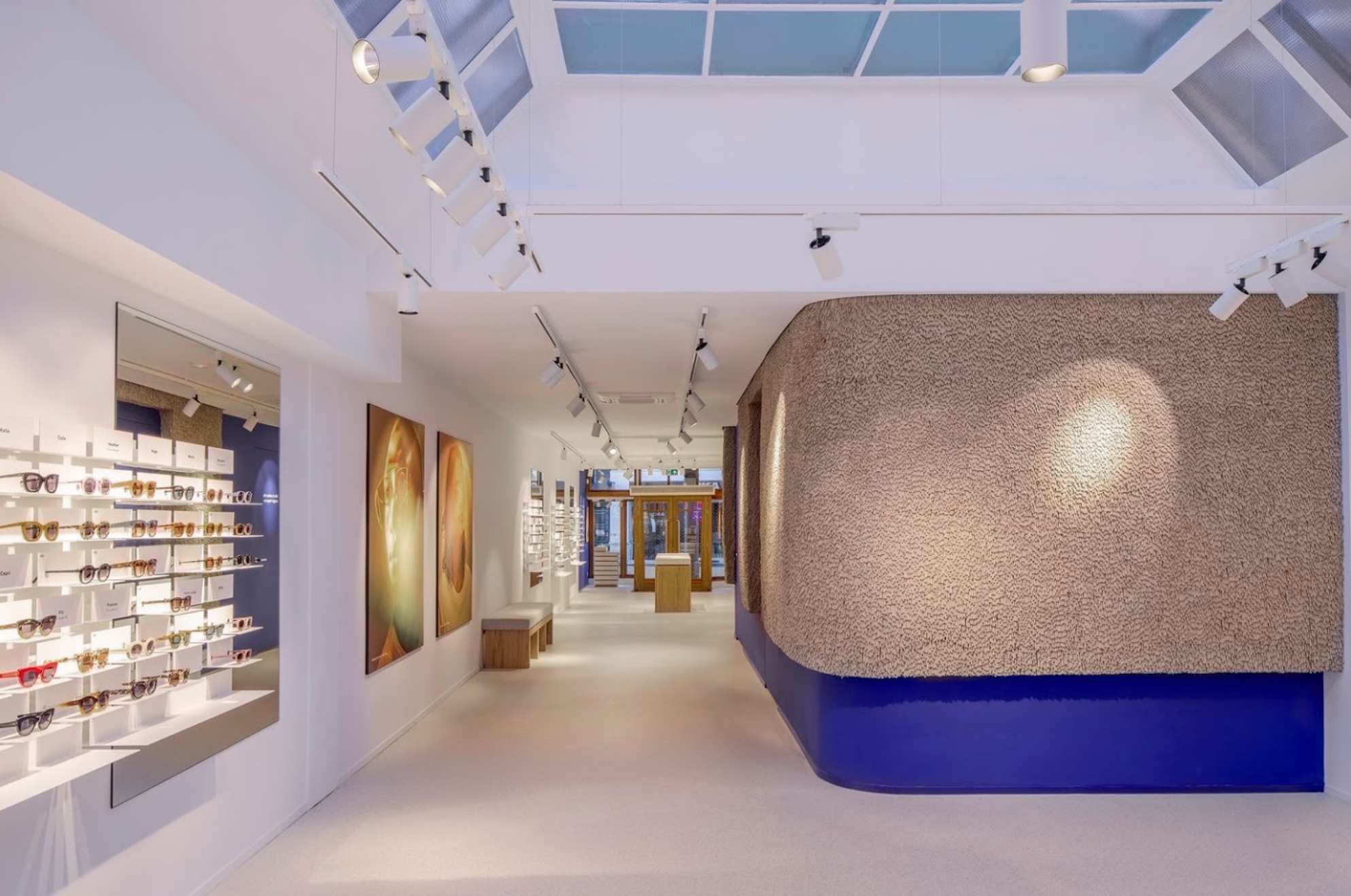
For the concept of this 50th Ace & tate store the studio has been inspired by the iconic architecture of the Kroller Muller Museum and especially the Rietveld pavilion situated in the beautifull park of the museum which is located in the natural reserve de Hoge Veluwe known for the beautifull purple colours in autumn of the heathland.
pictures by: Wouter van der Sar
completion: august 2019
address: Bakkerstraat 3, 6811EG Arnhem, NL
ACE & TATE
Dublin, Ireland
retaildesign
Dublin, Ireland
retaildesign
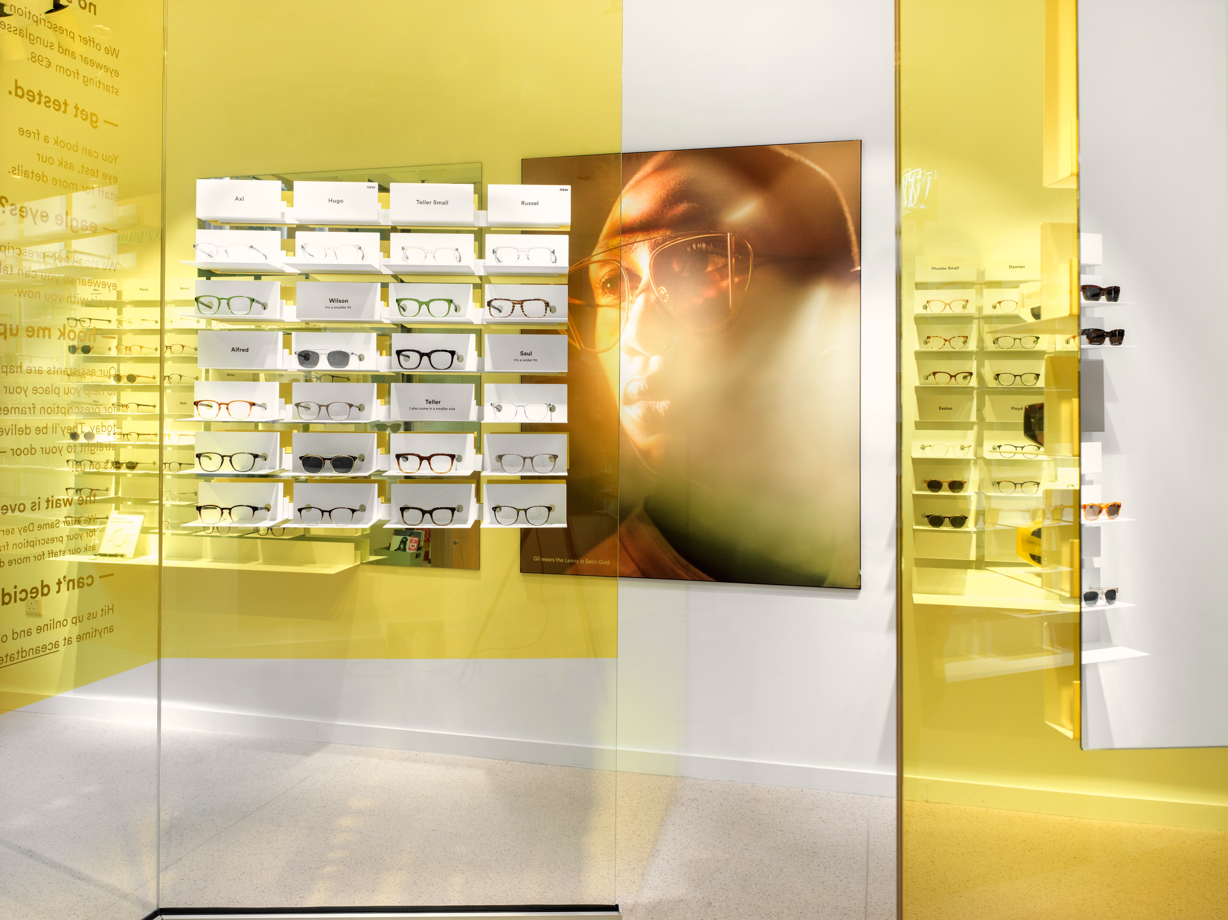
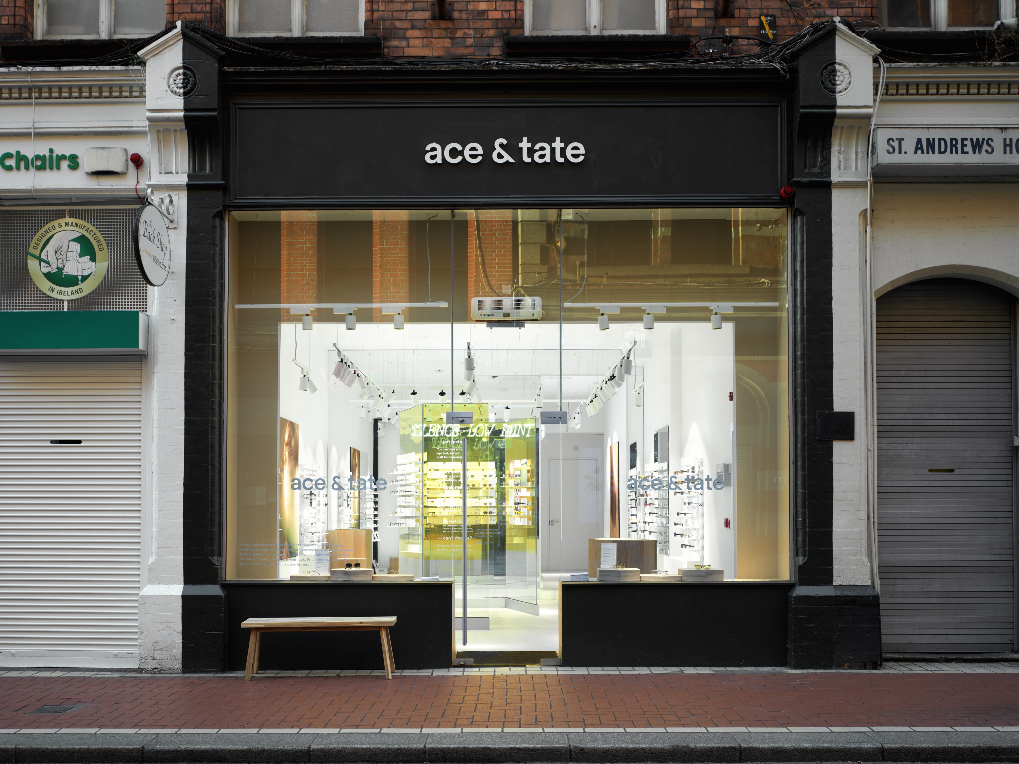
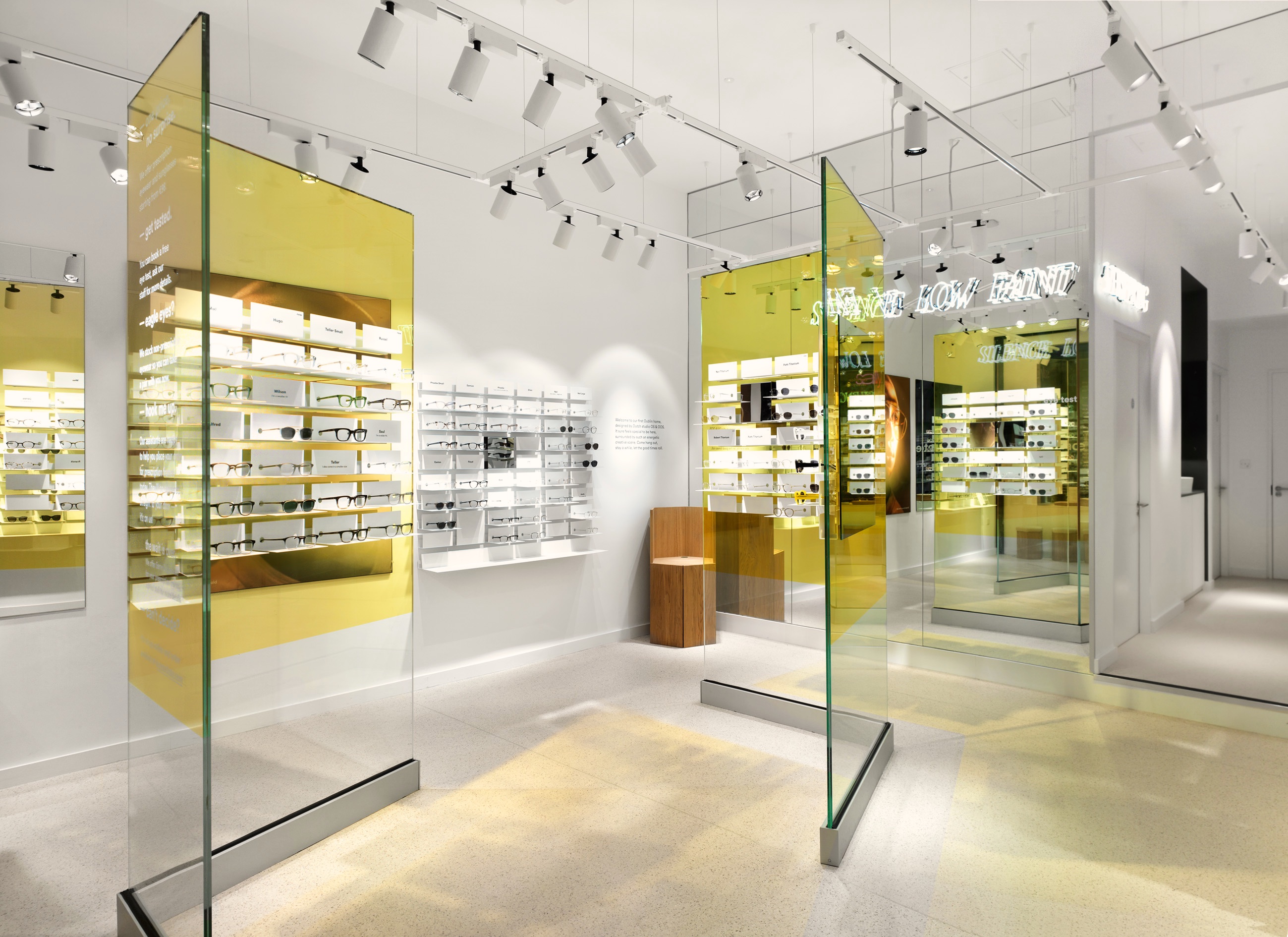
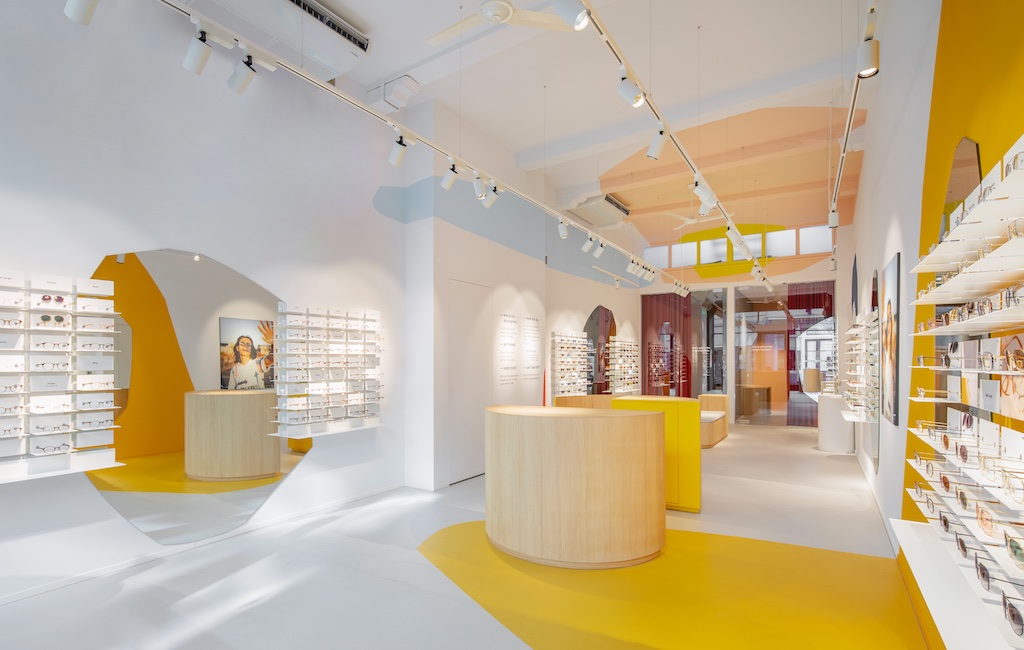
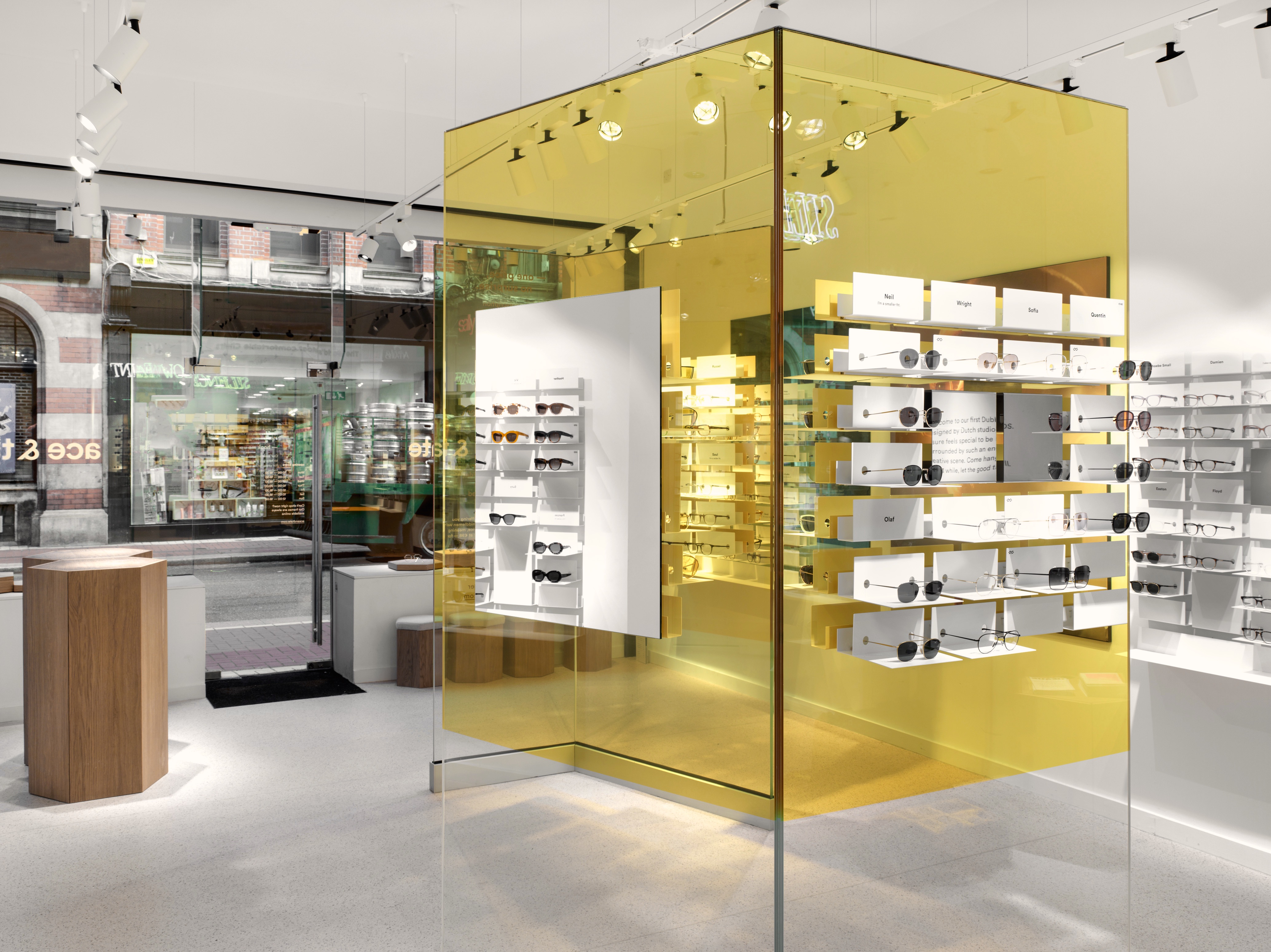
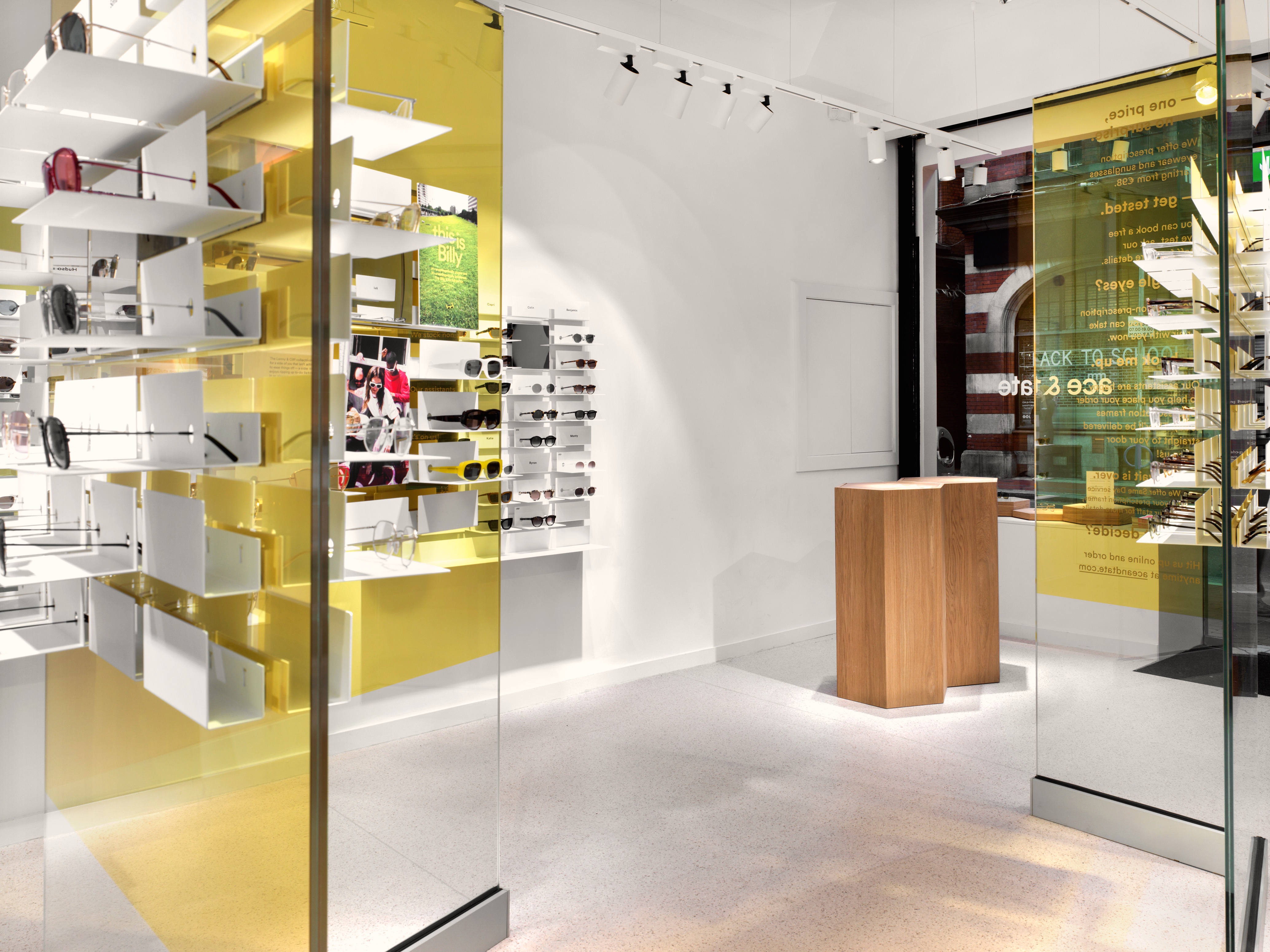
This store is one of the smallest retail stores from Ace & Tate. OS & OOS wanted to translate the reference of the name into a brighter atmosphere therefor they choose a bright yellow colour for the free standing glass screens, with the mirror on the back wall and the overlapping yellow screens when seen from the front create a darker colour yellow in the center.
client: Ace & Tate
pictures by: Erik Undéhn
completion: October 2018
address: Exchequer Street 30, D02 A038 Dublin, Ireland
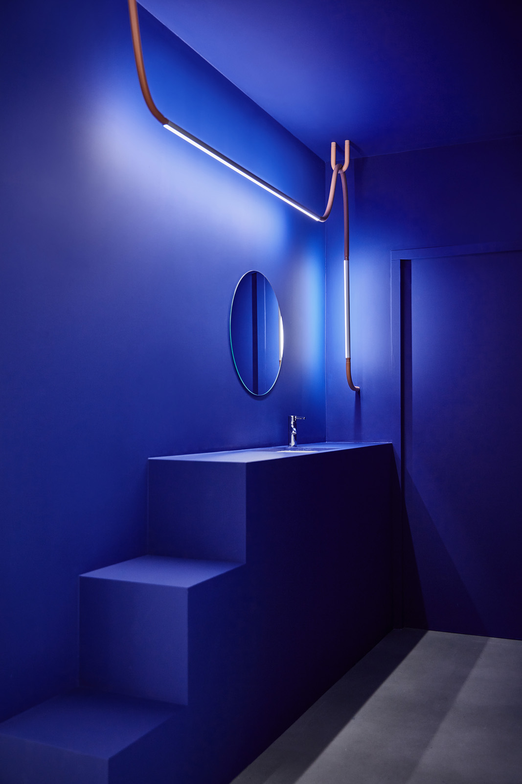
The name Dublin comes from the Irish word Dubhlinn, early Classical Irish Dubhlind/Duibhlind;
from dubh meaning “black, dark,”
and lind “pool”, referring to a dark tidal pool.

ACE & TATE
Eindhoven, NL
retaildesign
Eindhoven, NL
retaildesign
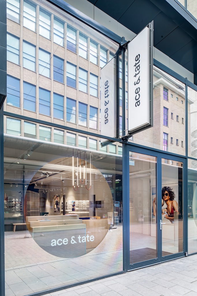
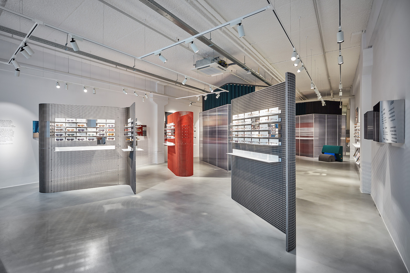
The store is situated on the Nieuwe Emmasingel, a promising area for the brand to settle in, with local favourite Van Piere bookshop nearby and the Design Academy Eindhoven just one short walk away. This is Ace & Tate’s biggest space so far, having enough space to fit two optician rooms and a large multifunctional podium with which customers can interact with.
This time, the brand collaborated with local studio OS & OOS, whom are known for their work in contemporary functional design. When designing our store, the creative duo behind OS & OOS sought inspiration in Eindhoven’s unique industrial architecture, whilst keeping within the concept ‘far sighted/near sighted’.
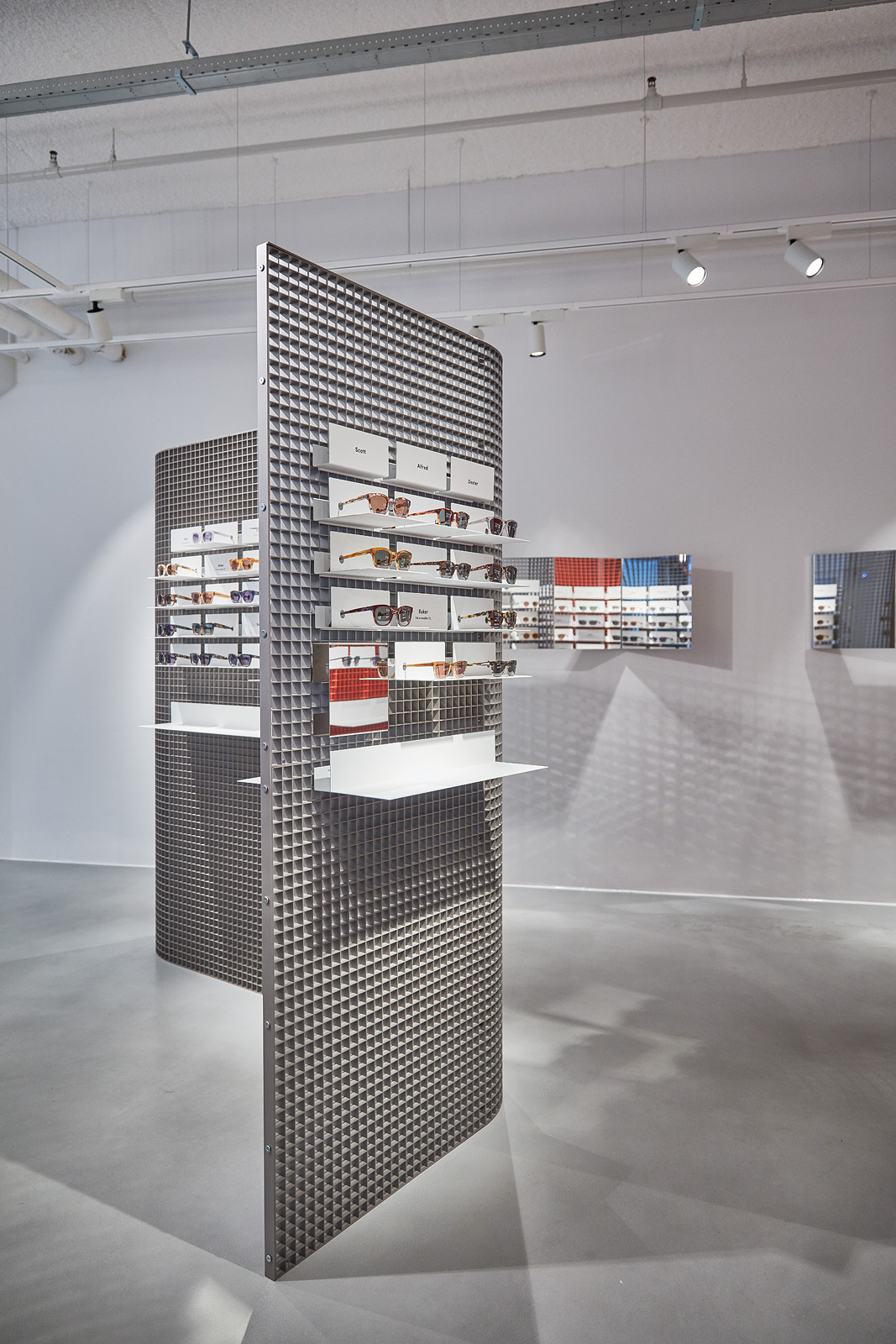
The result is a play on our visual perception, as the store’s slightly reflective façade draws you in, and the rest of the space slowly reveals itself. Recognisable elements were adapted to the theme: our display system was integrated into a loose standing metal grid - a nod to the city’s industrial architectural structures - and becomes transparent when seen from different angles.
The optician rooms have also been given a special treatment and are the store’s most prominent feature: when an eye test is in progress, the polycarbonate cubes are closed off by a curtain, and when not in use, their purpose is revealed.
client: Ace & Tate
pictures by: Jeroen van der Wielen
completion: july 2017
address: Nieuwe Emmasingel 26, 5611 AM Eindhoven, NL
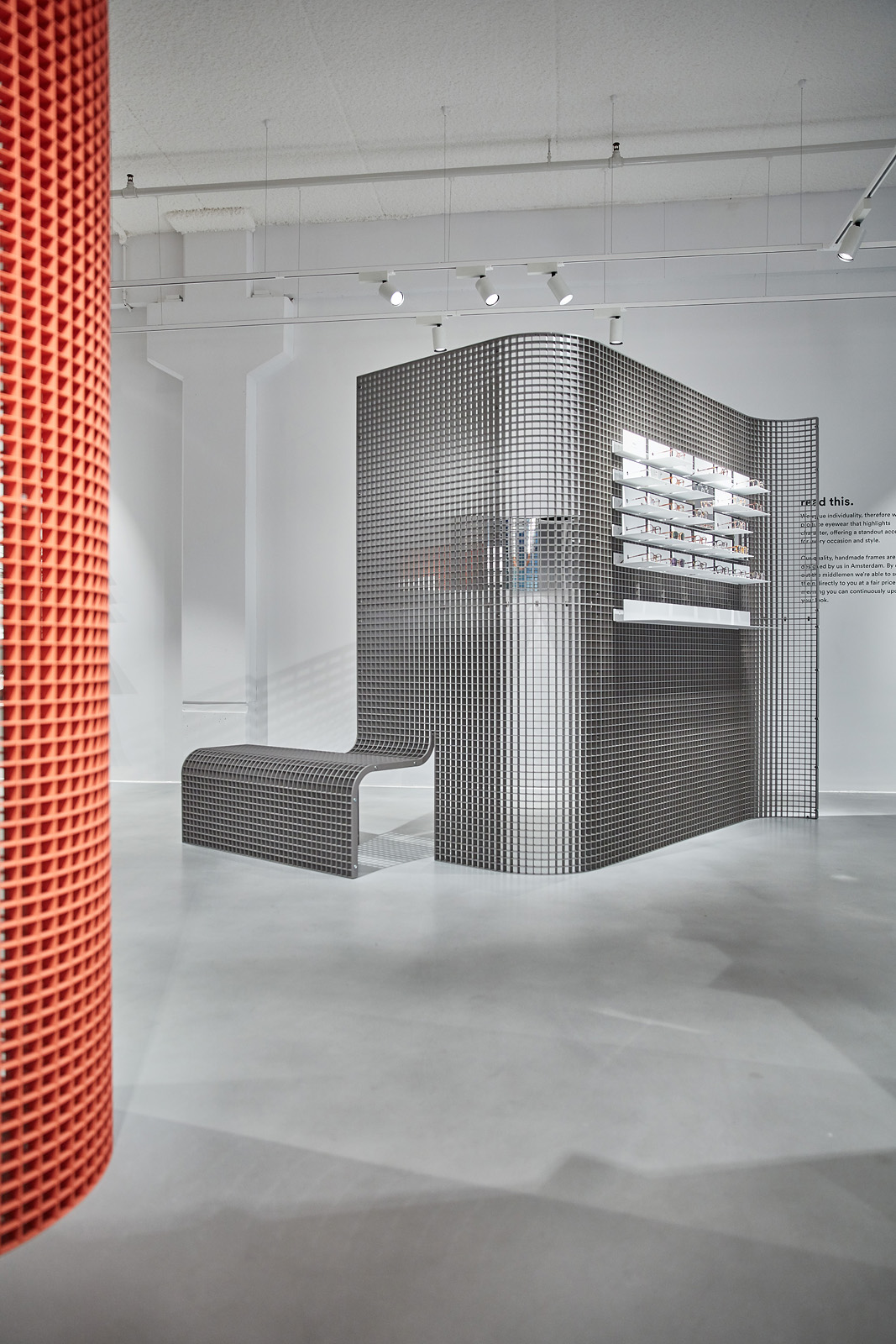
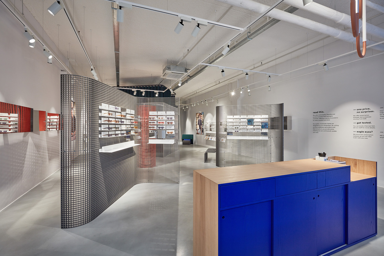

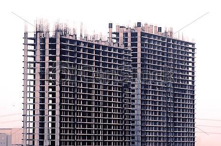
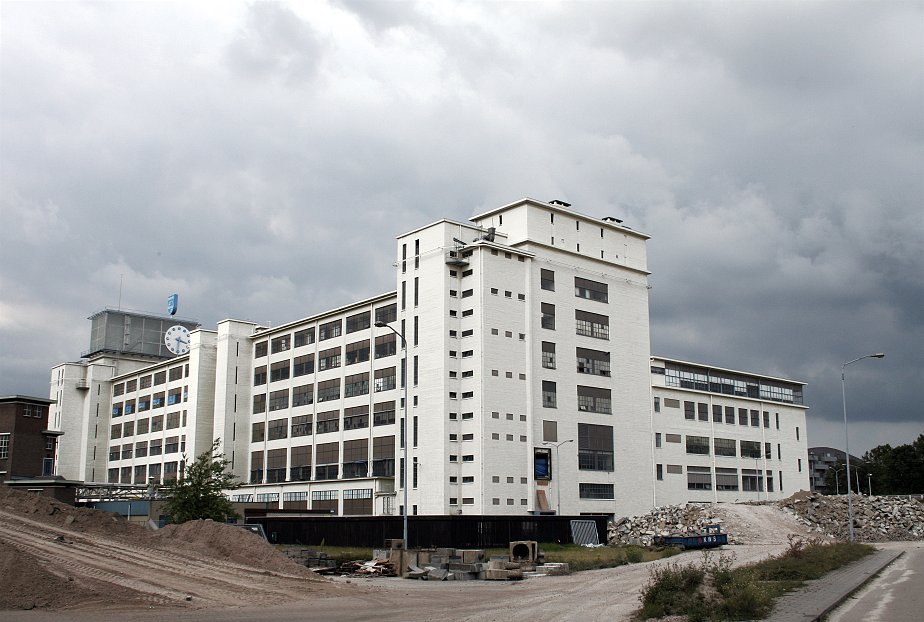
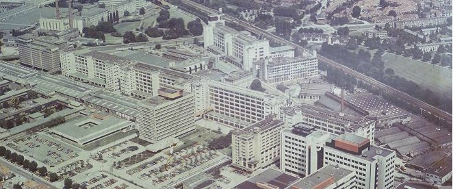
We sought inspiration in Eindhoven’s unique industrial architecture, whilst keeping within the concept ‘far sighted/near sighted
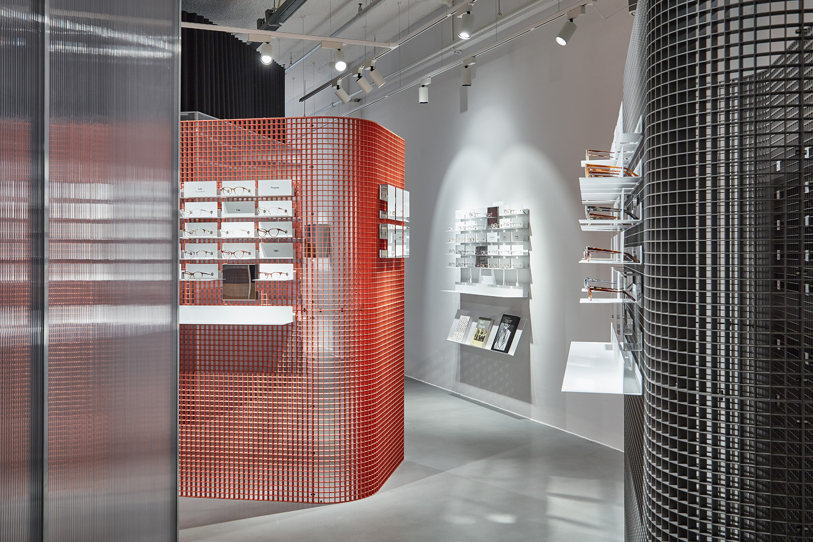
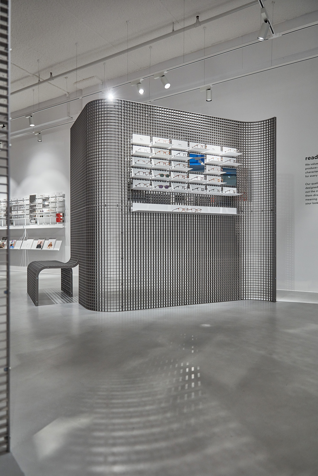
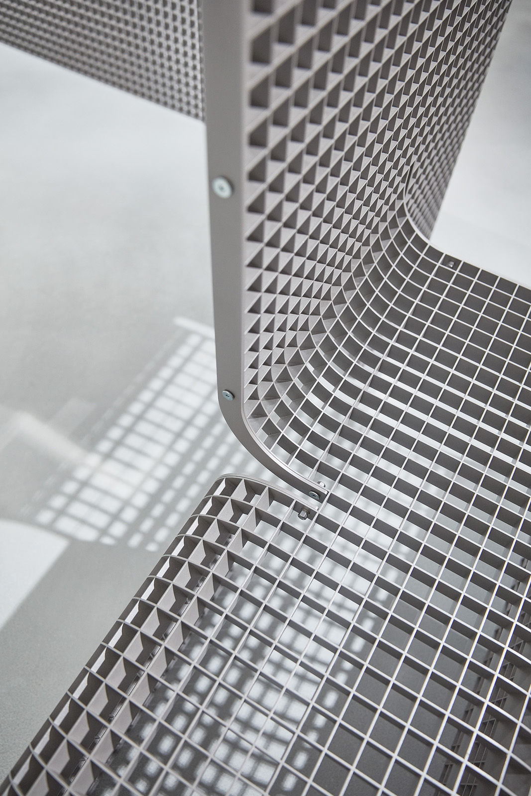
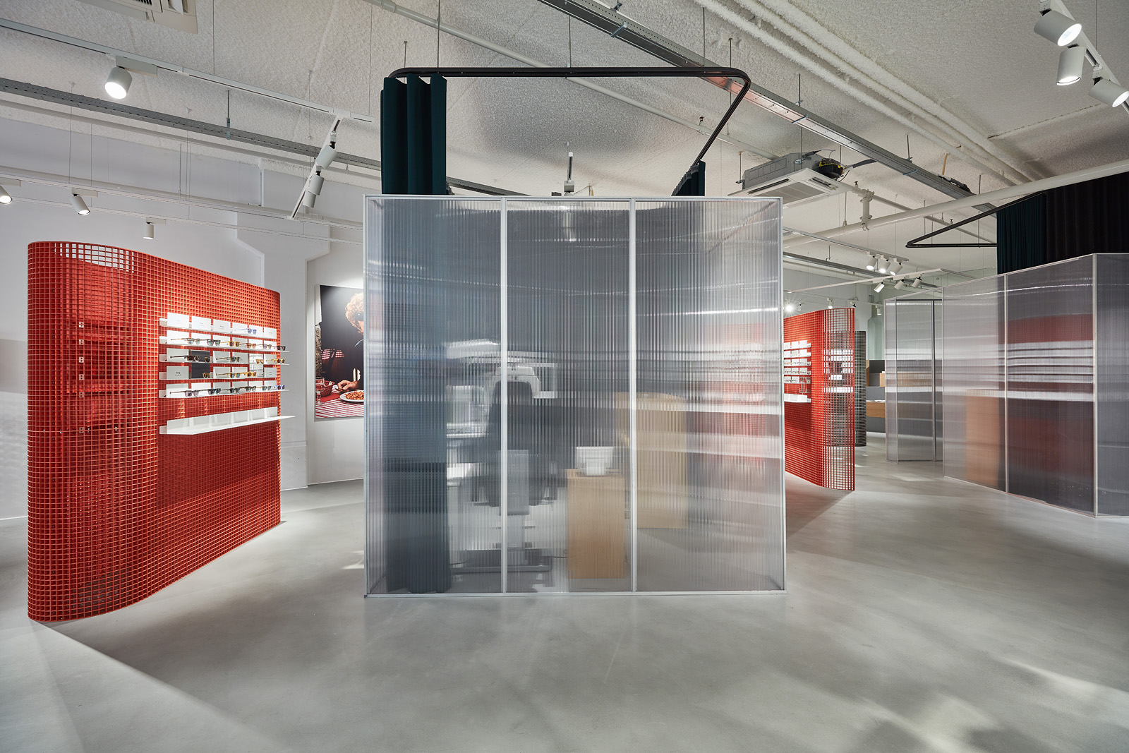
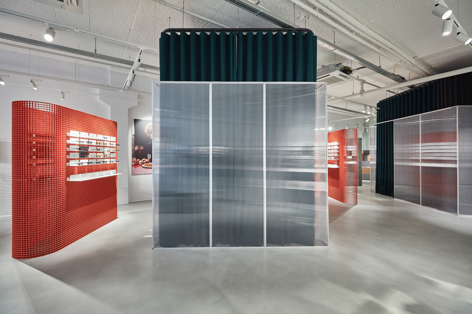
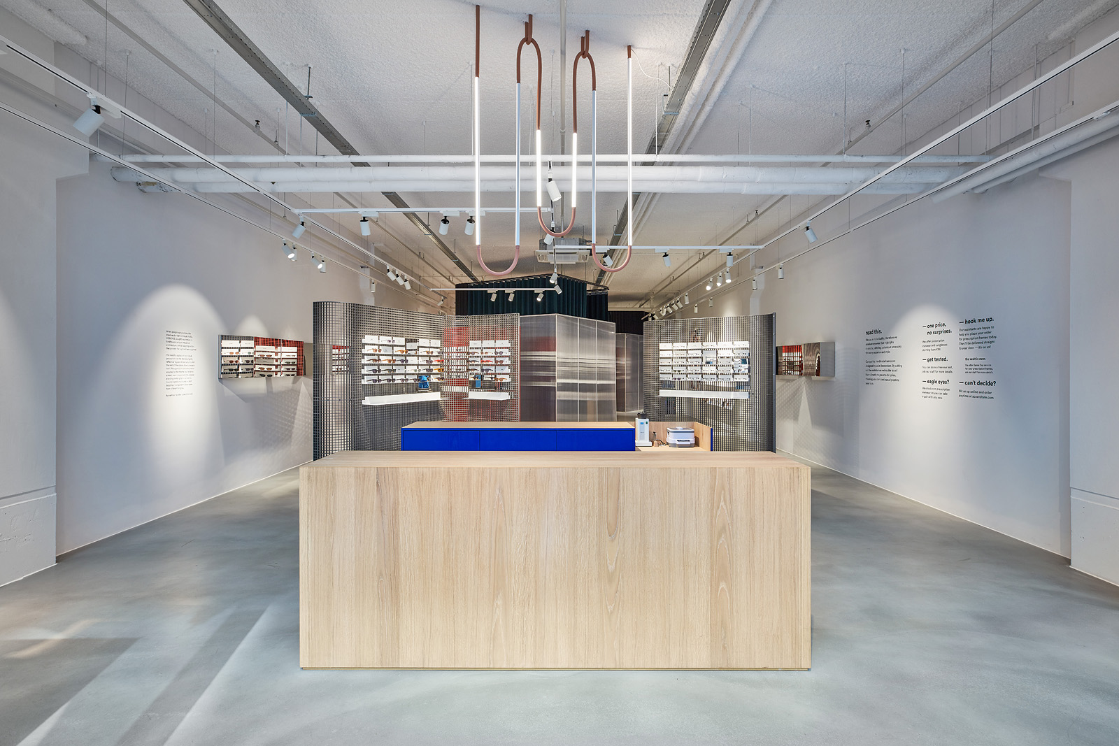
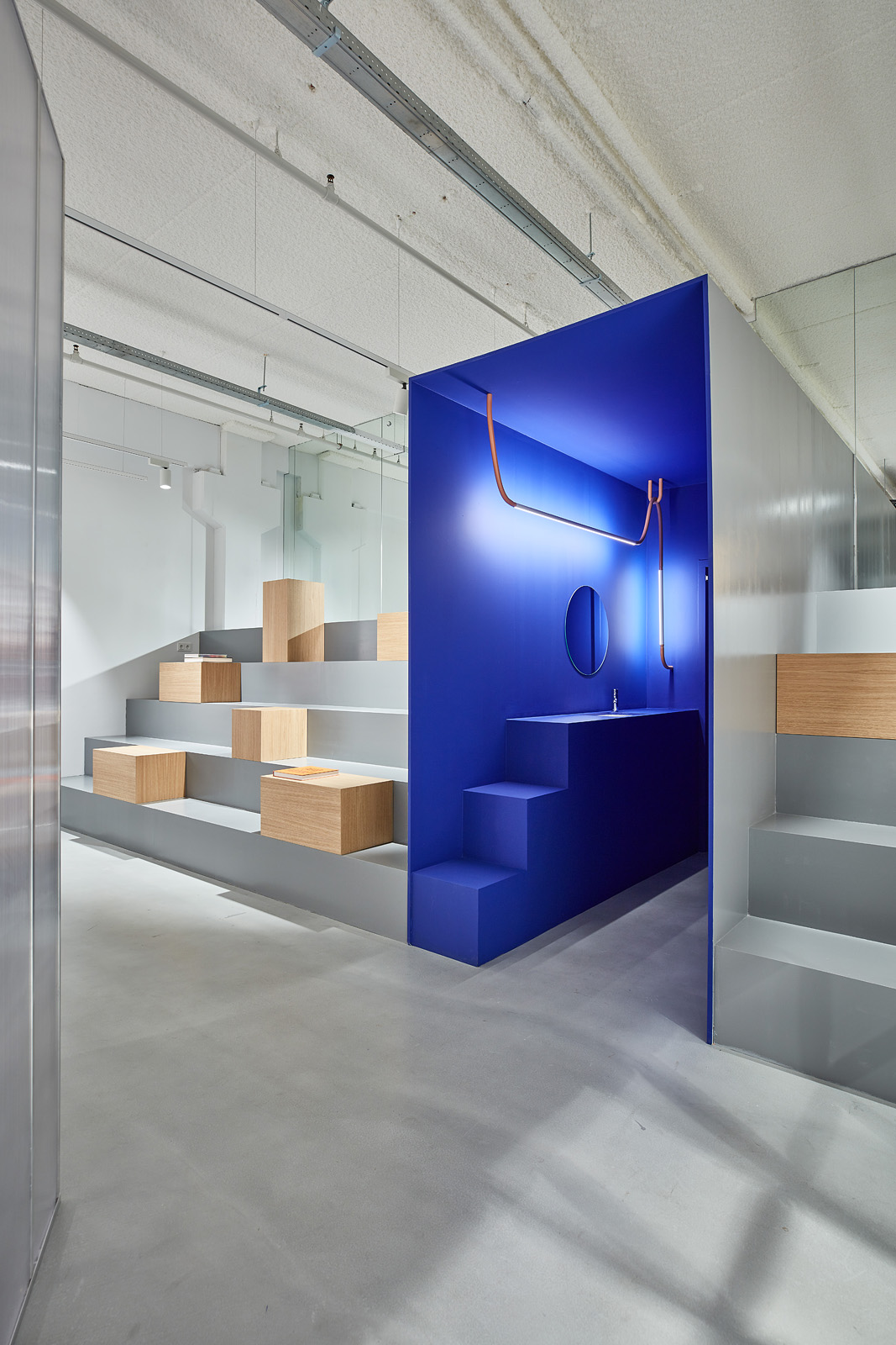
In the back of the store there is an area designed for different purposes
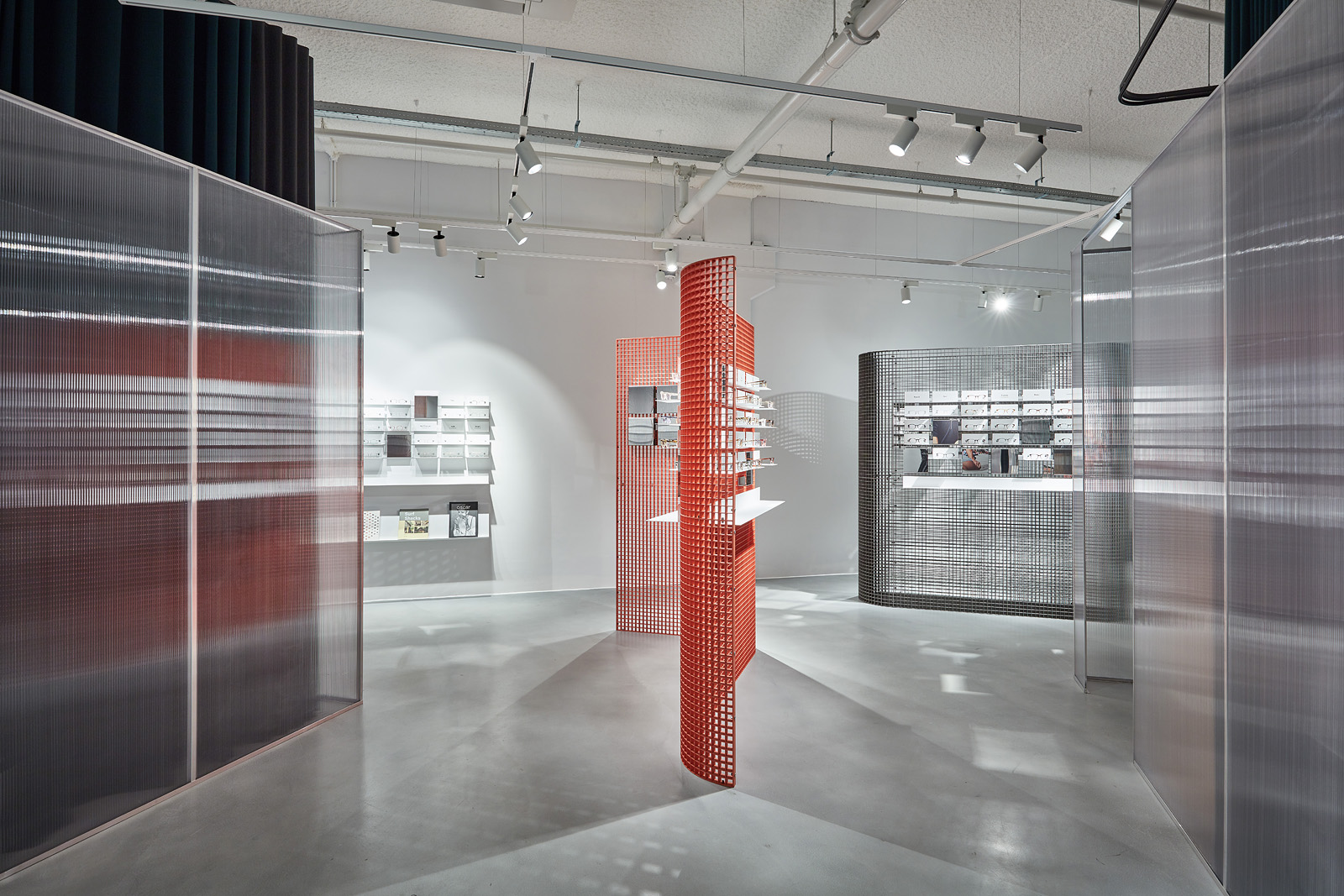
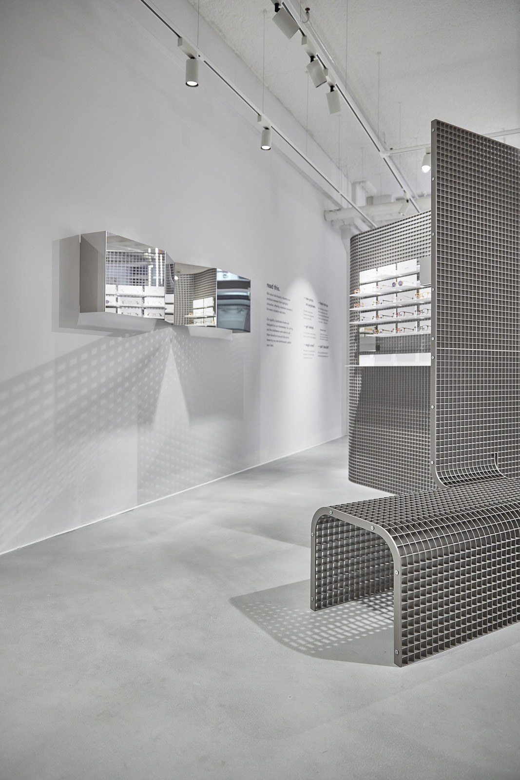


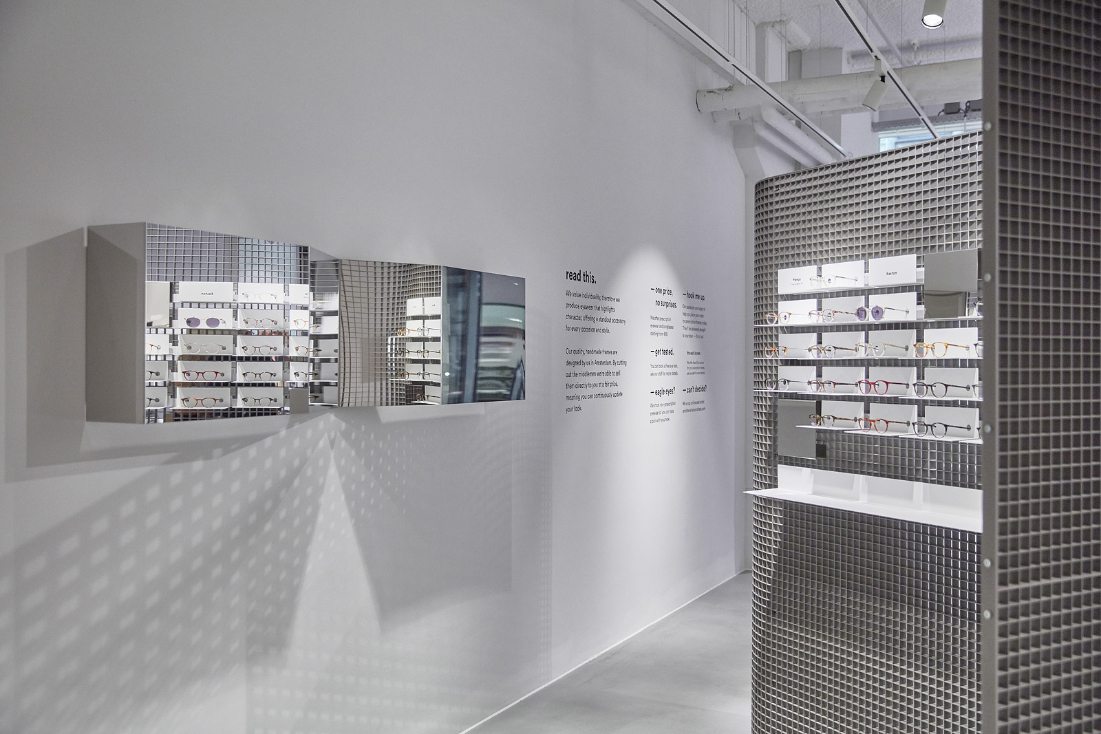
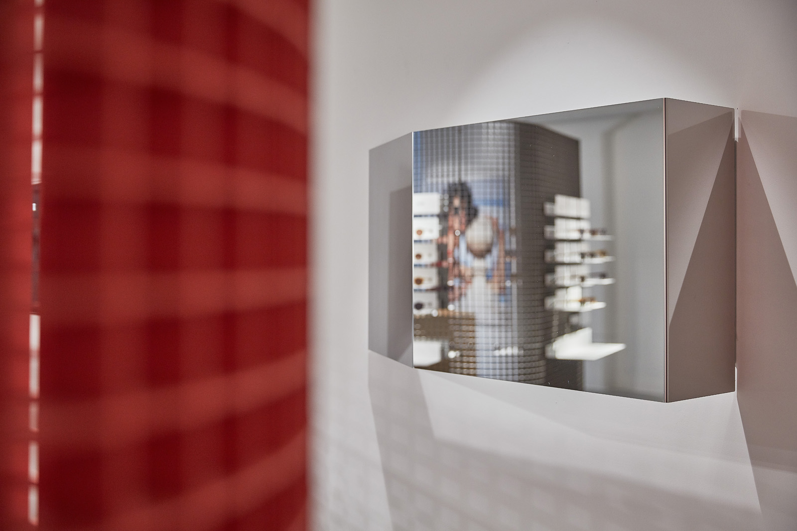
mirrors made out of highly polished stainless steel are designed to
ACE & TATE
Groningen, NL
retaildesign
Groningen, NL
retaildesign
Groningen’s rather substantial distance from other neighboring cities has made the city a lone wolf. But not one that has become shy and timmid but on the contrary; Groningen is a city purely individual and not afraid to be bold and is recognised for its daring architecture and a substantial student population which contributes to its youthful nature. As a student you are in constant development and constatly taking on new challanges, a student must be pragmatic and adaptive, showing thier willingness through a “work with what you have mentality”.
Our concept threfor for the Gronignen Ace & Tate store centerlize aroud out of the box thinking with a bold look and approch to the interior along side a simple, not over complicated communicaion to the customers and cleaver, yet simple furniture/features the city recognises with only a few “winks” to Gronignens past. For Groningen is clearly a city with it’s eye on the future.
client: Ace & Tate
pictures by: Wouter van der Sar
completion: November 2018
address: Brugstraat 19, 9712 AB Groningen, the Netherlands
